AuroFix
Online store
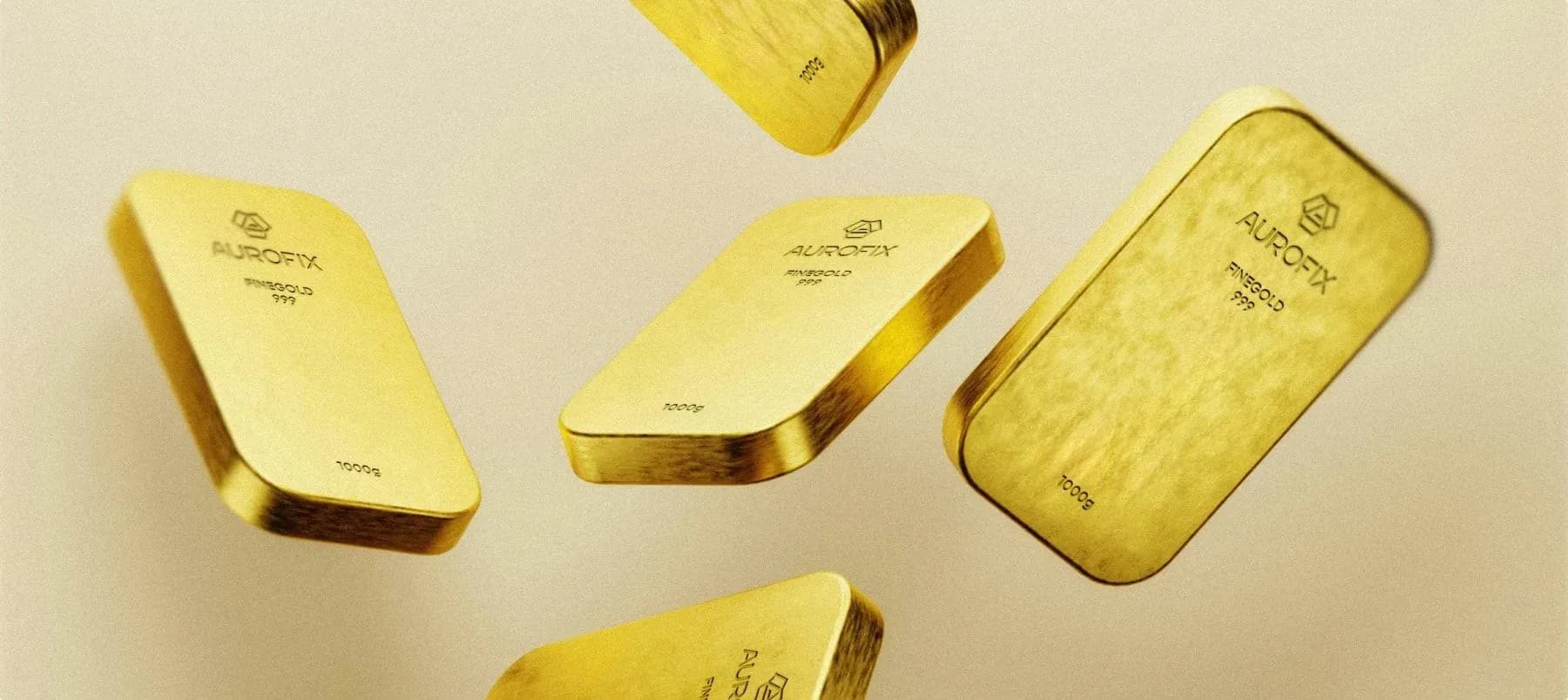
Brand and online store for a Berlin dealer who buys gold for cash and sells it in bars
Started with the category, because everyone in it promises the same thing
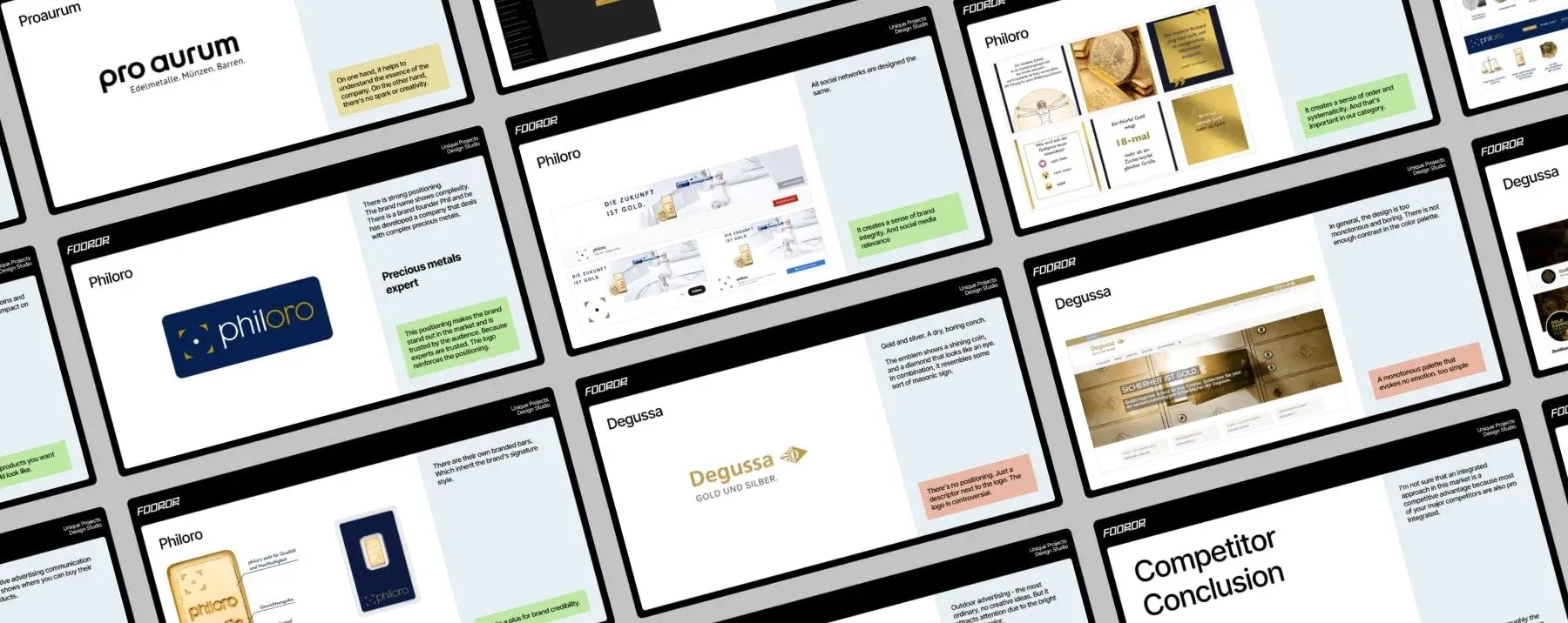
Before drawing anything, I went through the German market — pro aurum, Philoro, Degussa and others — section by section: what each promises on the first screen, how it backs up that promise, what it does with price, and how it treats someone selling gold for the first time.
The pattern was obvious. Trust in this category is stated, not shown. Everyone is seriös, everyone is transparent, and almost no one backs it up with a number, a verification result, or the name of a real person on the page.
That set the direction for both parts of the work: prove first, decorate second. It also revealed a visual opening, since the category is almost entirely split between gold on dark blue and gold on black.
The mark they arrived with couldn't be stamped, embroidered, or shrunk
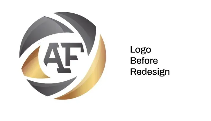
The old logo was a gradient monogram: A and F fused into a shape that read like a swirl of metal at poster size, and like a blur at any practical size.
A precious metals brand has to survive stamping on a bar, embroidery on a polo, engraving on a nail-sized capsule, and shrinking to sixteen pixels in a browser tab. This one survived none of that, because a gradient stops being a gradient the moment it becomes a single color.
Rebuilt it into one shape in one color: a bar seen from above, with an A running through it
The new mark is a hexagon drawn as a bar of metal seen from above, with the diagonal of the letter A running through the middle. The bar and the letter are the same shape, so the mark says what the company does before anyone reads the name.
One weight, no gradient, black on yellow. It can be stamped, embroidered, engraved — and it still reads at favicon size.
Yellow was a deliberate choice. The category is almost without exception dark blue and black, and yellow reads as a shop you can walk into, not an institution you apply to. It was also the one color competitors had left untouched.

Built the system from the mark itself, then placed it on the street, on the box, and on the screen at the same time
Everything else comes from the logo. The hexagon becomes a pattern, the diagonal of the A sets the angle every crop and every stripe is cut at, and the palette rests on two colors plus whatever metal is in the photo.
I designed the signage, the packaging, and the interface together, not one after another. A brand for a business with a physical counter has to survive the trip from the street to the register to the phone, and the fastest way to check that is to draw all three at once.

Gave the outdoor ad a statement instead of a slogan, and gave the packaging a reason to be kept
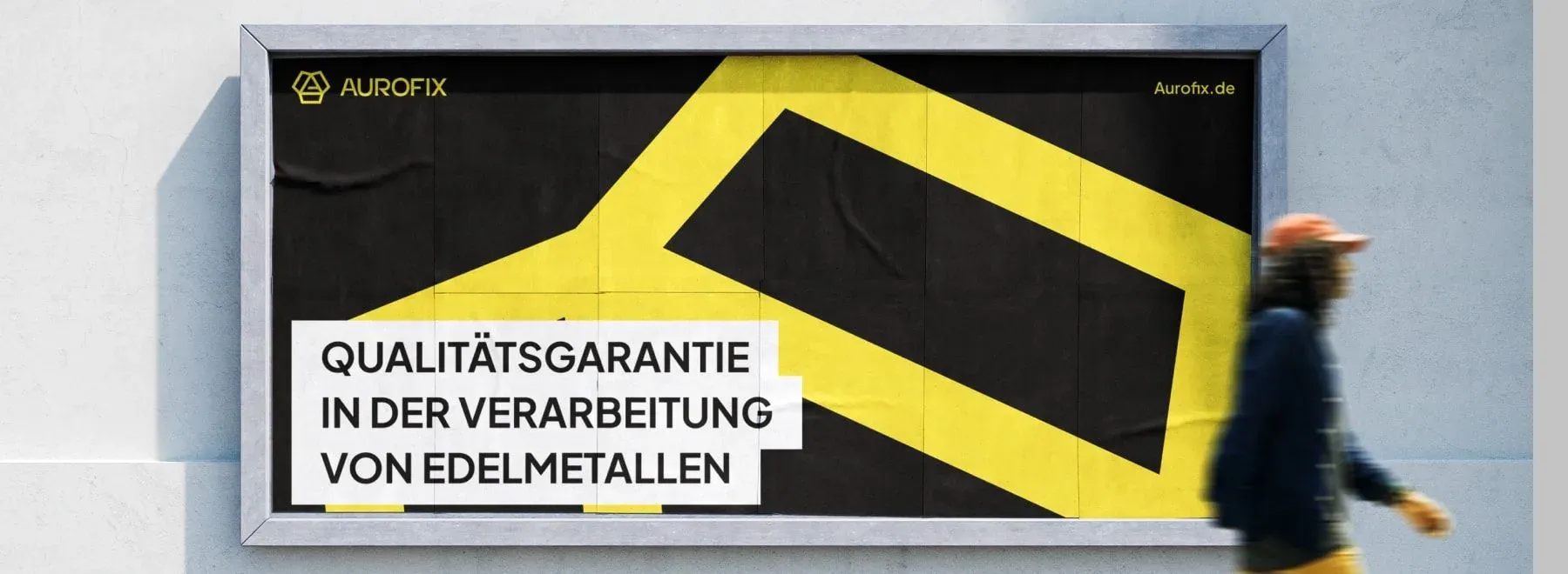
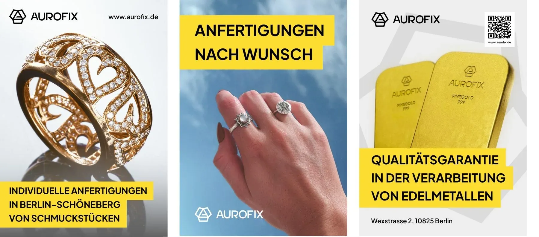
The poster carries one line — a guarantee on quality of work — set large enough to read from across the street. In a category built on distrust, a specific promise beats any adjective.
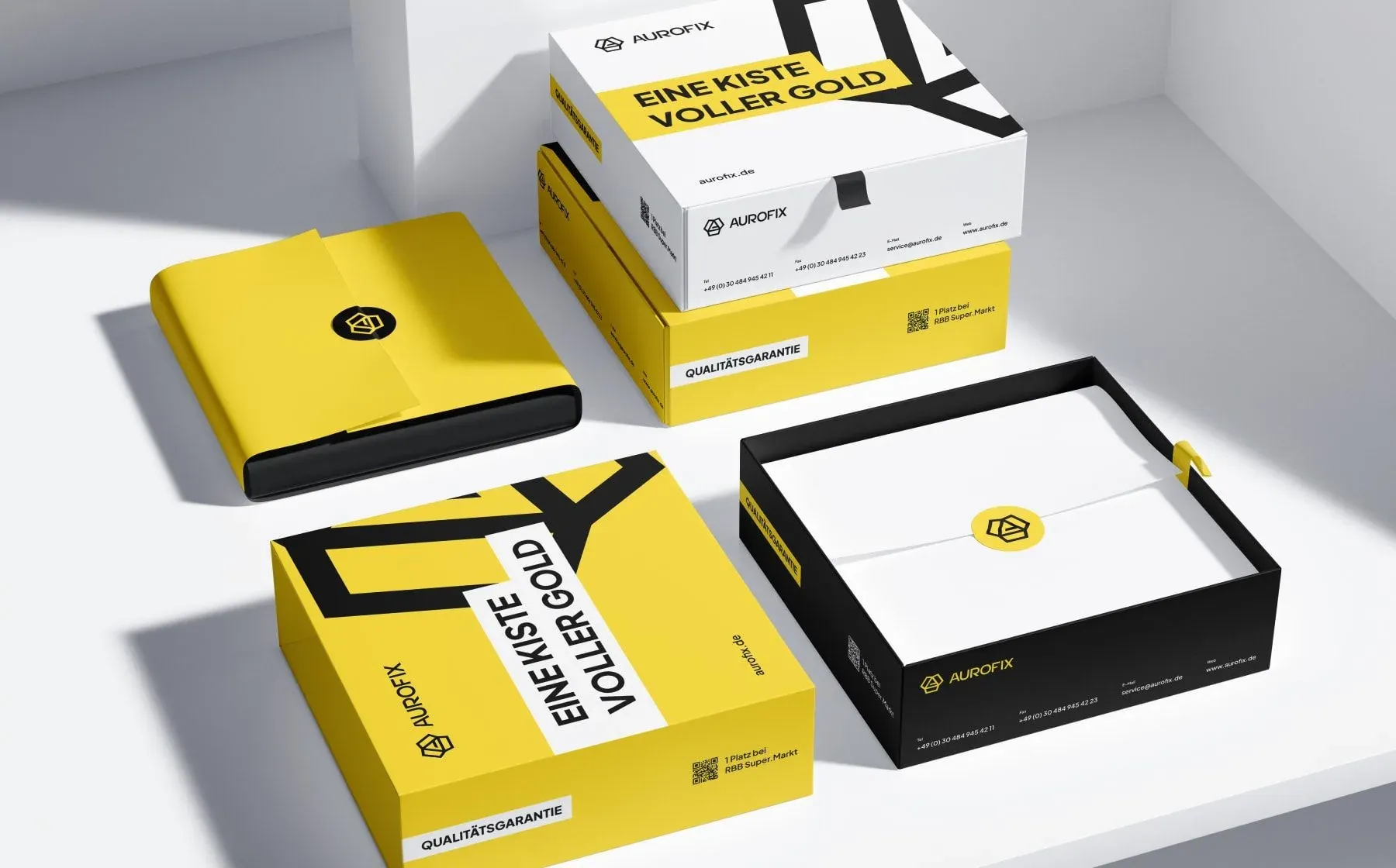
The boxes are for what leaves the shop: a bar, a coin, a repaired ring. It's the one part of the brand the customer takes home and keeps, so it got the strongest copy in the system, not the logo tucked in a corner.
Built the campaign around the three things people actually come in for
The ad campaign is built as a small set of cards, one for each offer that brings someone through the door: custom pieces, individual work with precious metals, and a guarantee on the work.
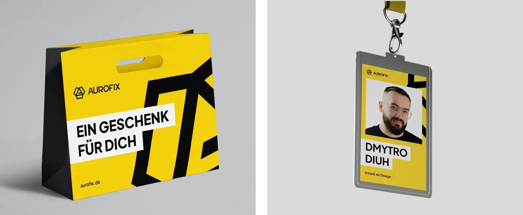
The rest of the print materials cover moments the website never sees — the bag a purchase leaves in, the badge of the person who weighed your gold. For a business where the deciding conversation happens across a counter, these aren't souvenirs — they're the interface.
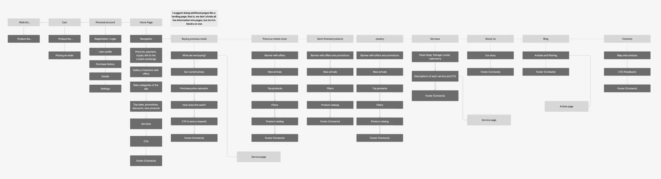
Mapped out the shop's structure before designing it, because four audiences need four front doors
Structure came first: a sitemap covering every path through the business — buy metal from us, sell metal to us, order semi-finished stock, book a service, read the blog, find a store.
I then narrowed the navigation to just these routes and nothing else: Ankauf, Shop, Halbzeuge, Services, about us, contact. One structure, four entry points, and no page that exists just because there was room for it in the menu.
Opened the homepage with proof, and let price lead where price is the main argument
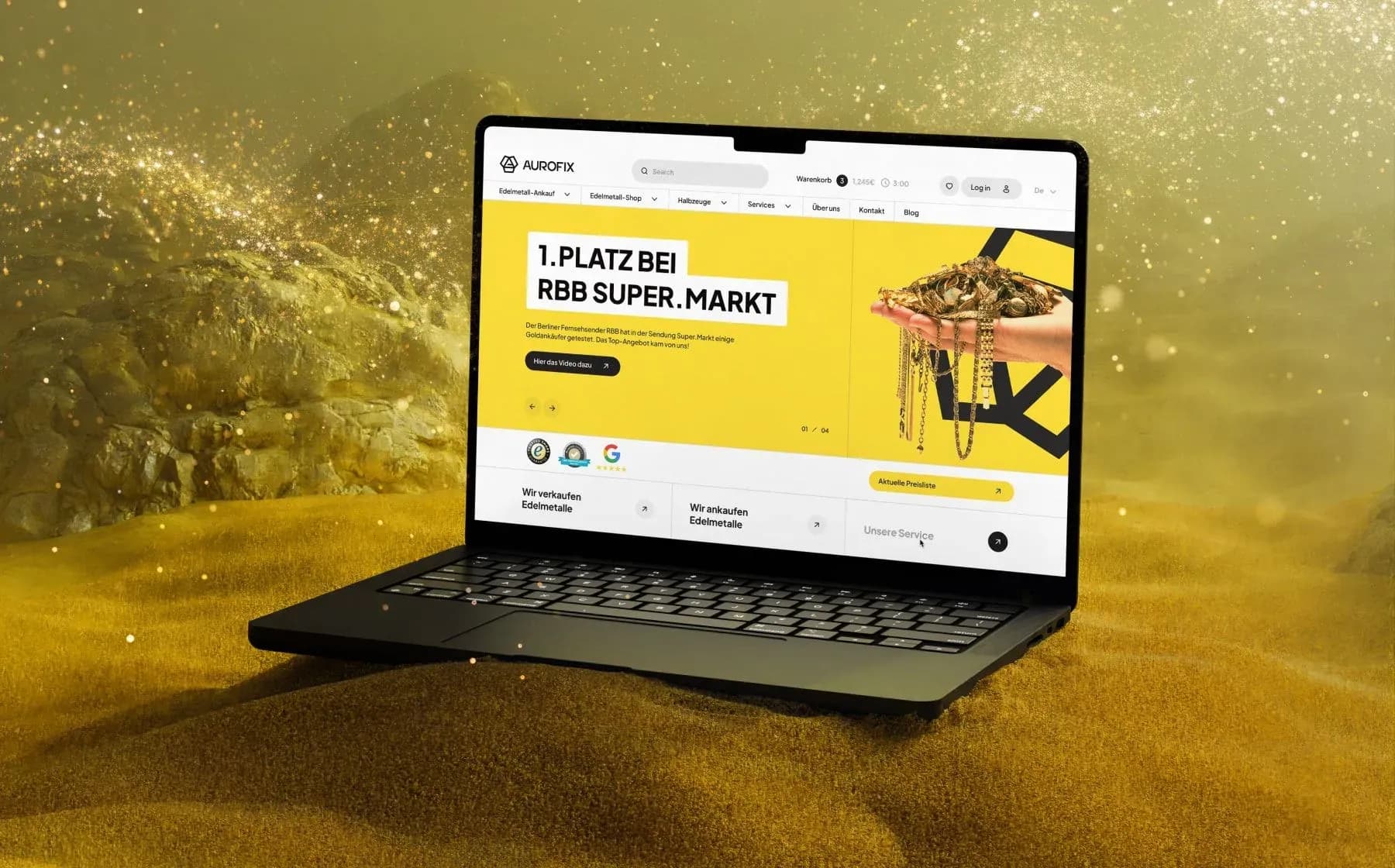
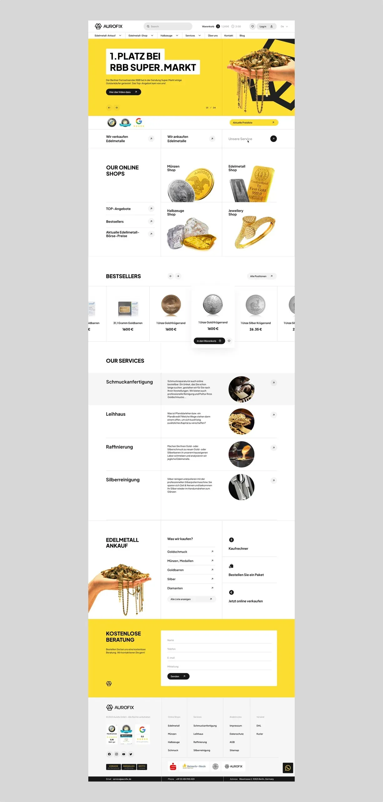
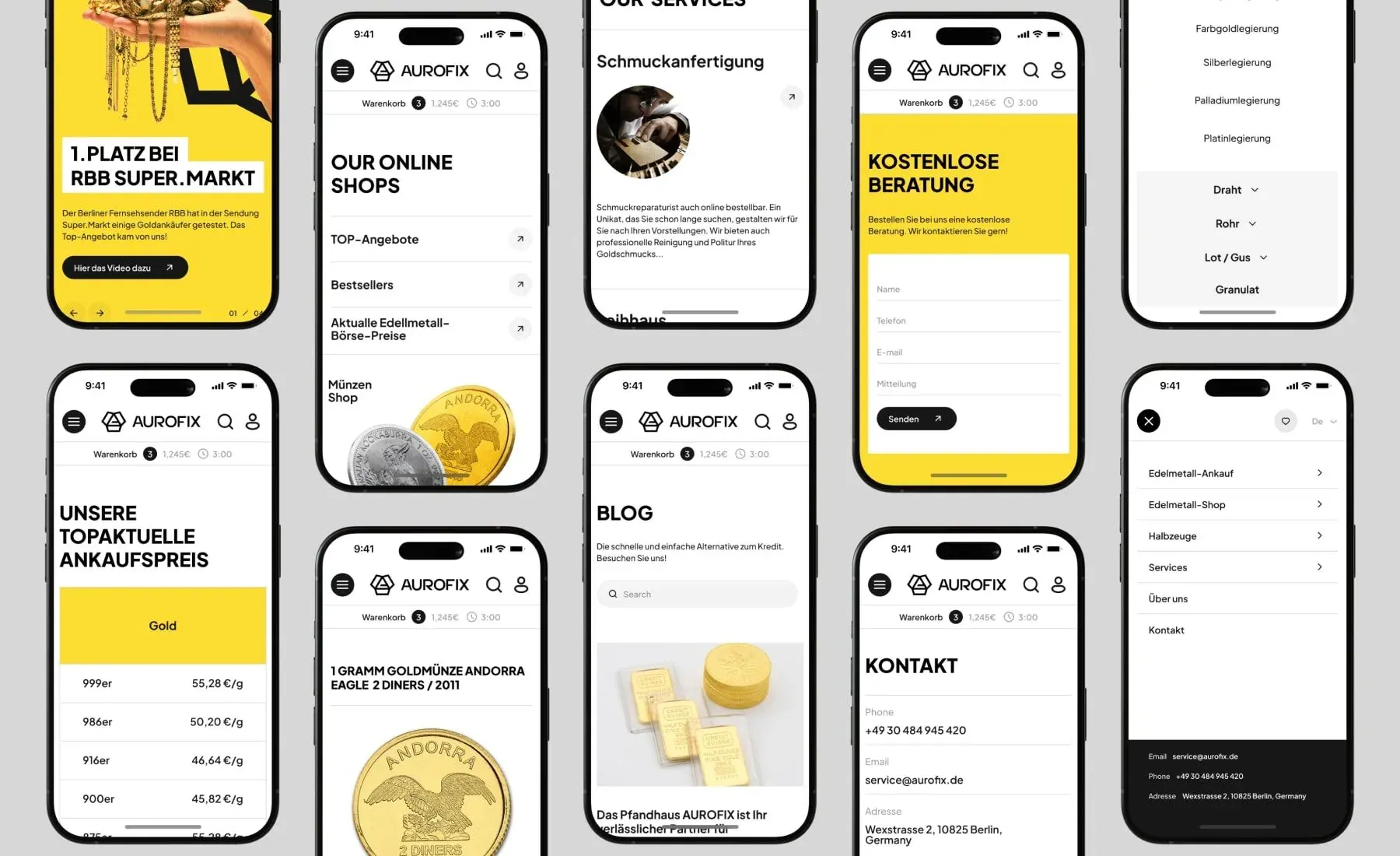
The homepage opens with a first-place ranking in RBB Super.Markt's comparison of Berlin gold buyers, linked to the broadcast. In a market where every dealer calls itself trustworthy, one TV segment beats any adjective on any competitor's homepage.
Below that, the four stores are presented as four doors, followed by bestsellers, services, and a buyback calculator that gives a price before anyone has to call or show up in person. The page ends with a free consultation form, since part of this audience will always want to talk to a person.
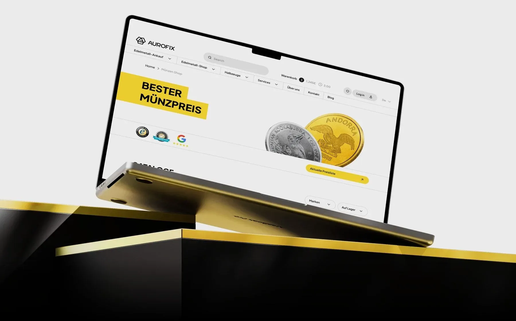
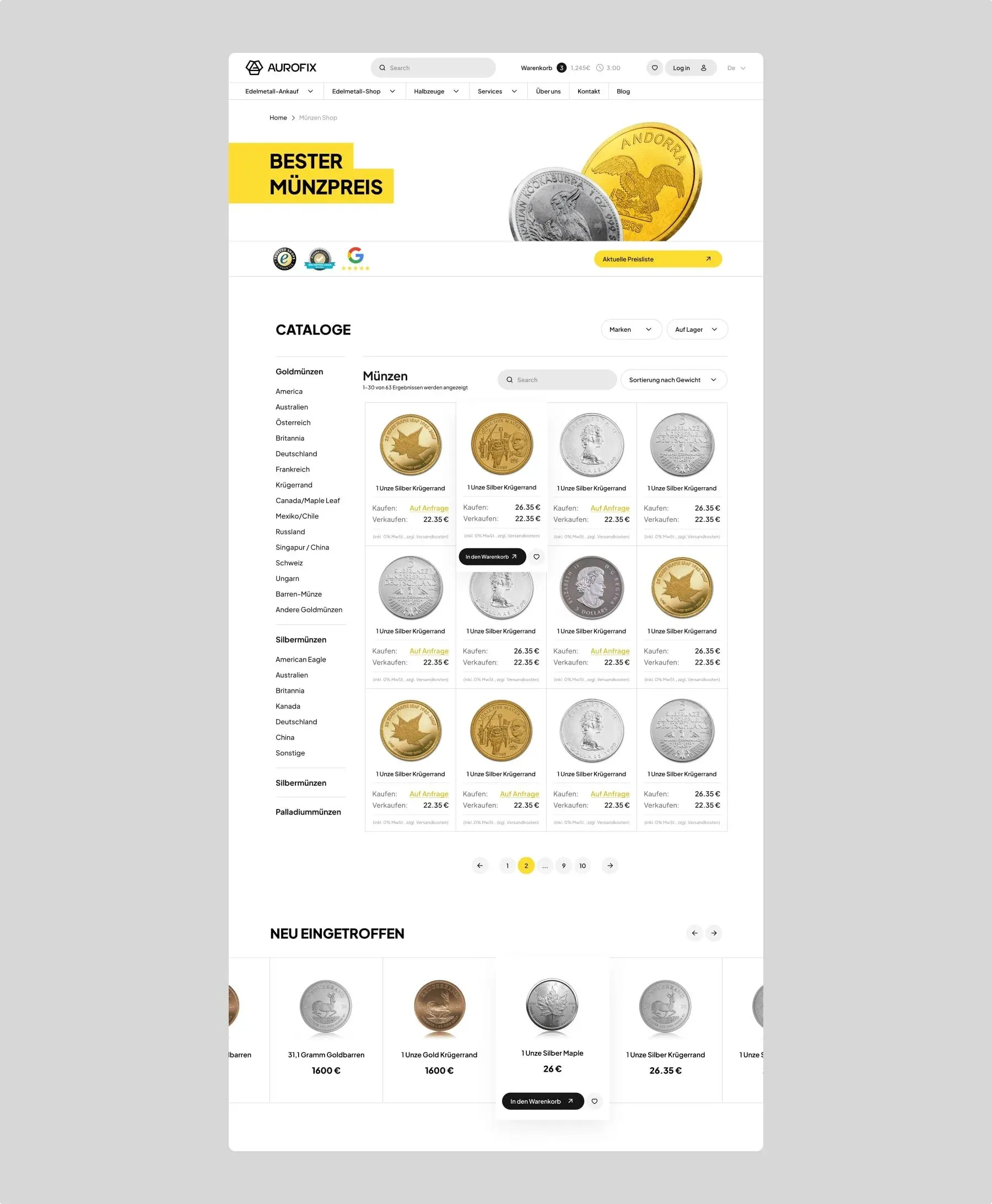
The coin shop starts differently. Coin buyers compare the same thing across every dealer, so the page leads with price and says so right in the headline.
Put the spec sheet before the sales copy — right where a bullion buyer starts reading
The catalog filters the way this product is actually chosen — by metal, weight, mint, year — with filters left open on the side instead of hidden behind a button.
On mobile, the same catalog collapses into a single column and the filters move into a slide-out panel, but nothing disappears. A buyer comparing spreads on the way home shouldn't get a stripped-down version of the shop.
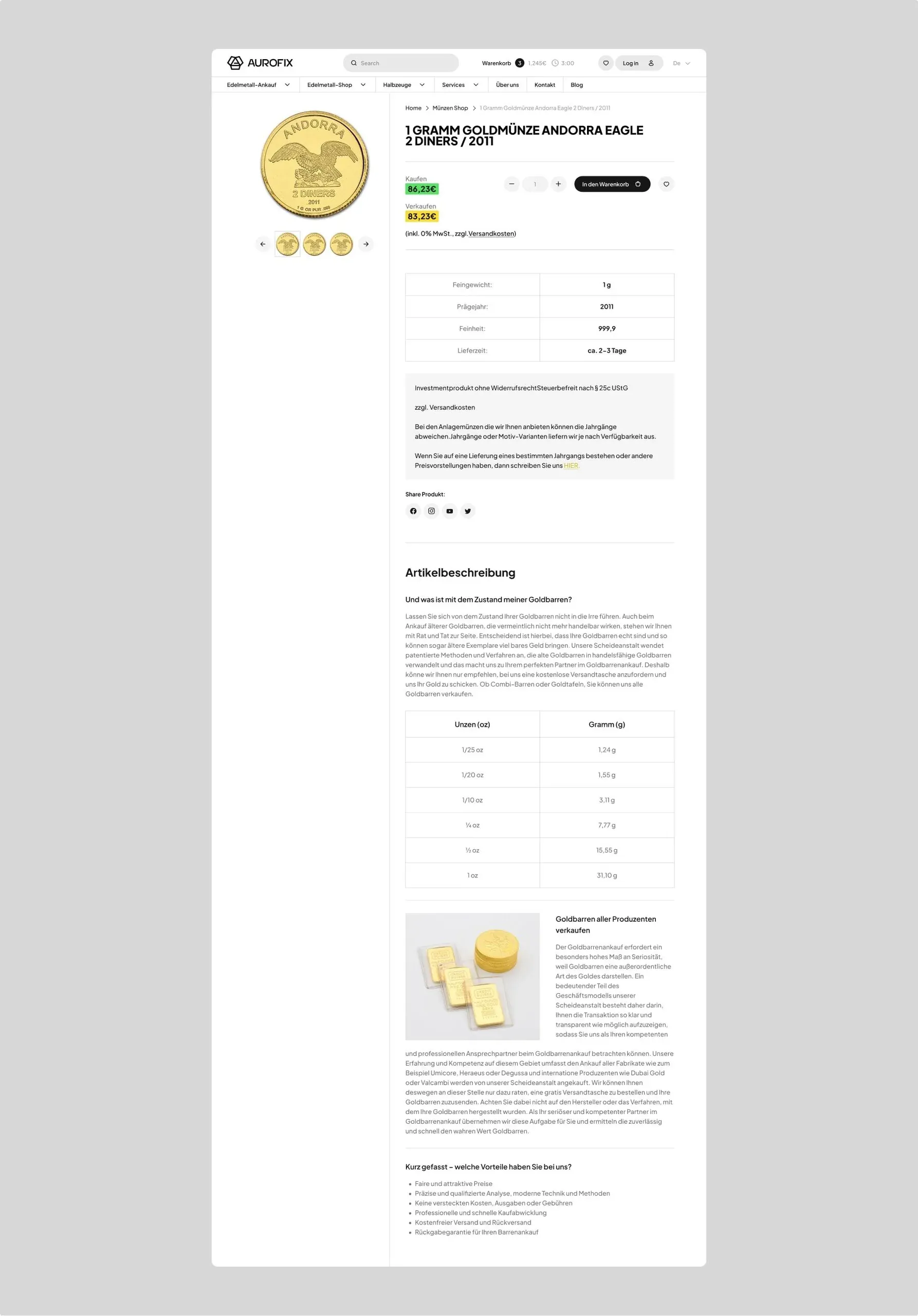
The product page opens with a specs table: metal, purity, weight, mint, year, condition. The description sits below. Someone buying a one-ounce coin checks those six numbers first and only reads the text once the numbers satisfy them.
Other works
Drag the works sideways or use the left and right arrows. Automatic movement pauses on focus.