UltraViolet
Online store
Online store for a women's fashion brand, designed for the screen it's actually opened on
Designed a women's clothing store from scratch, starting with how people actually shop
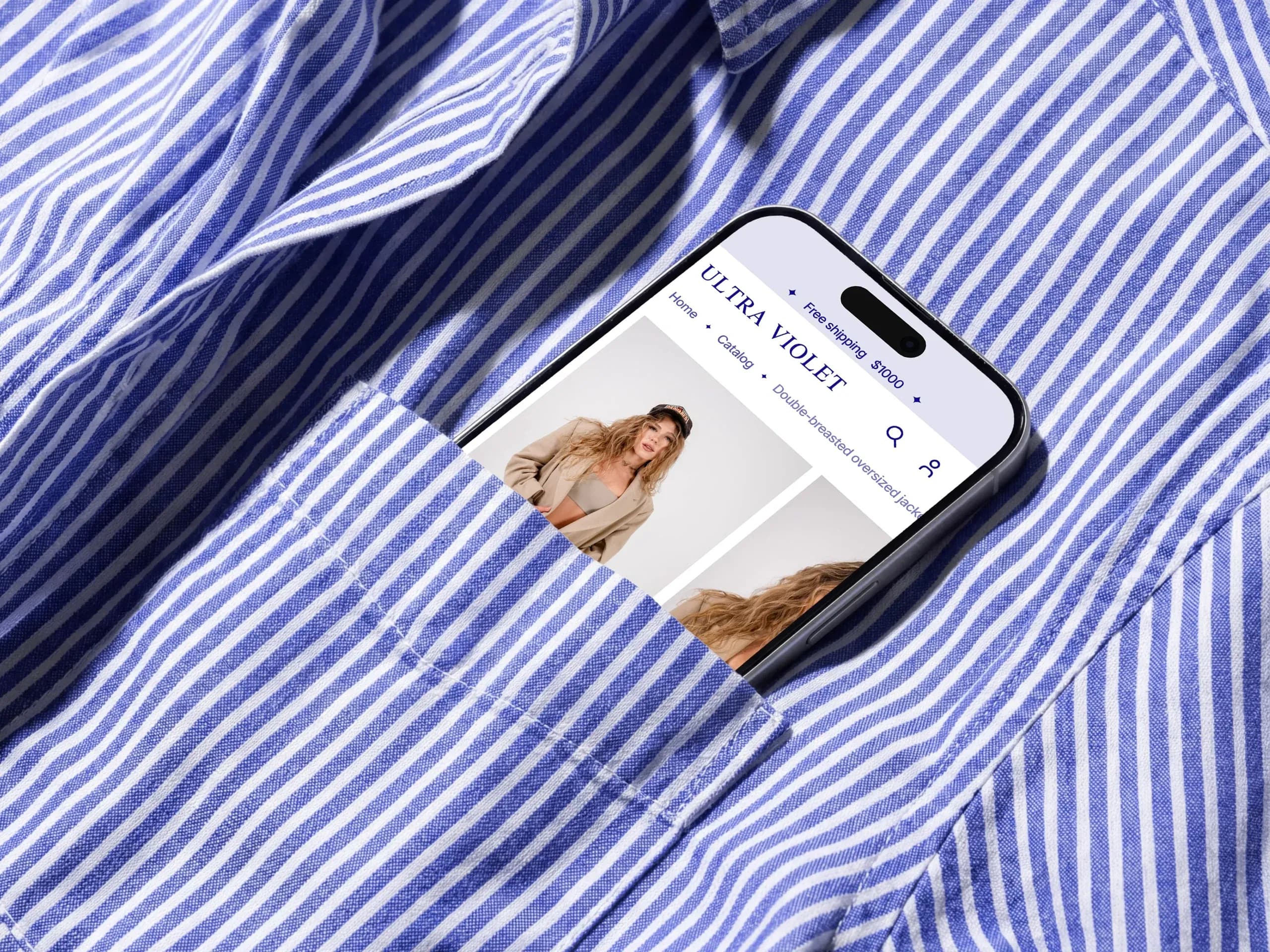
UltraViolet is a Ukrainian online store for women's clothing. There was no existing site to improve on — I started by analyzing competitors and studying what's already known about usability in this category, and drew every screen from there.
An online store has to do two things at once: be usable and be memorable. One rich violet color, a white field and one repeated shape take care of the second. Everything else in this case is about the first.


Hid the entire catalog behind one layer and made search return products, not pages
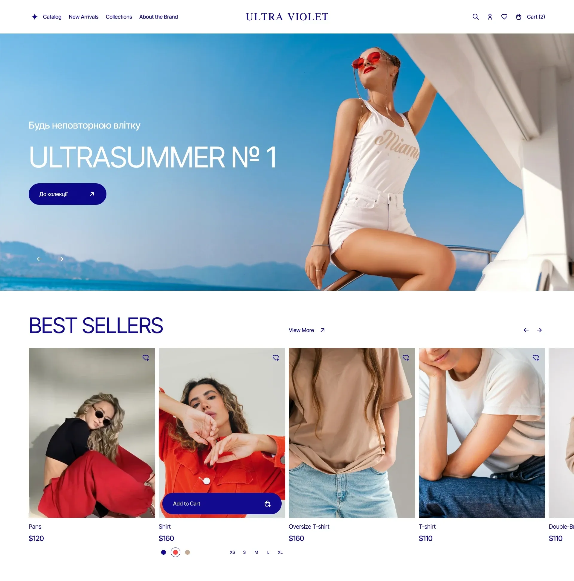
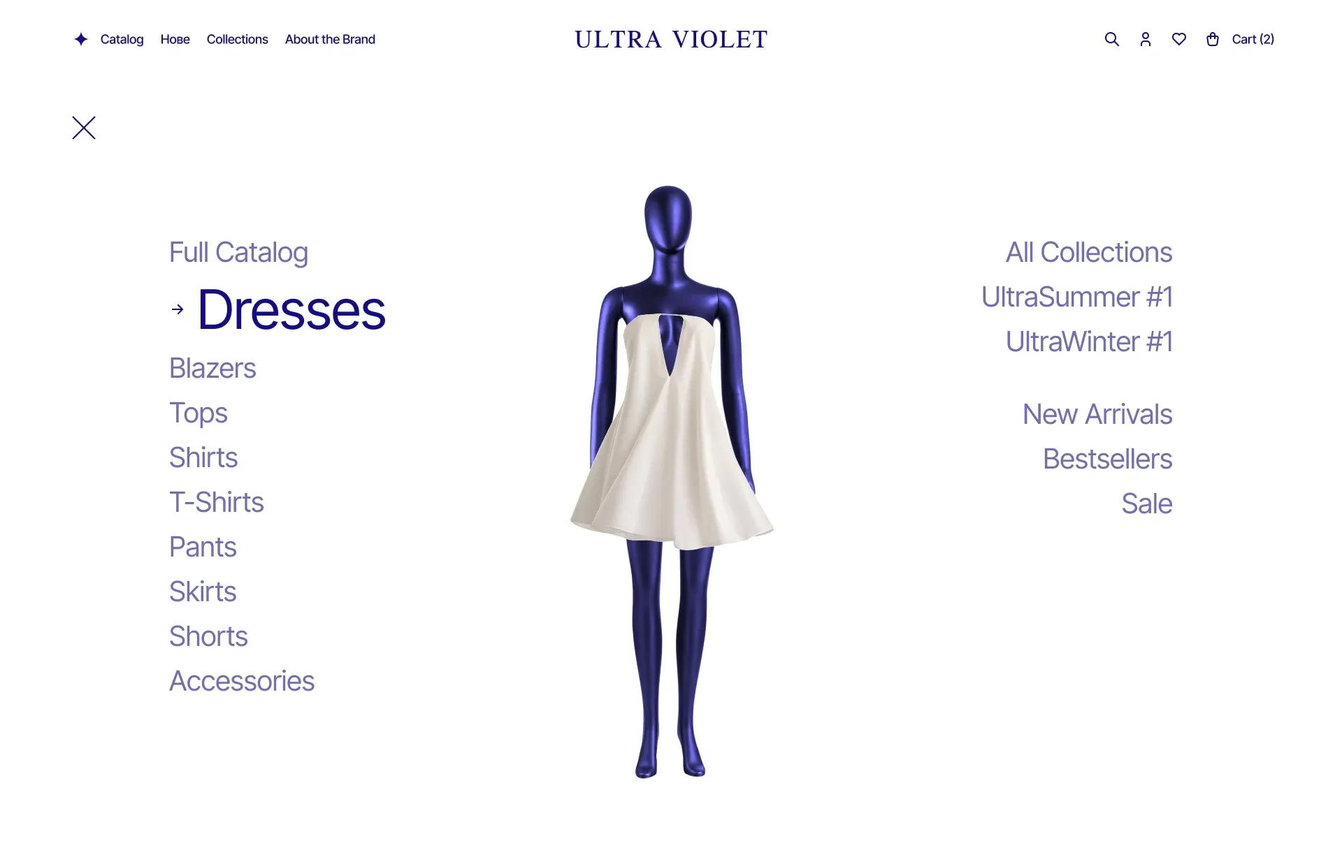
Navigation opens as a fullscreen layer, not a dropdown menu: dresses, jackets, tops, shirts, collections and new arrivals — all visible at once, instead of unfolding submenus one by one.
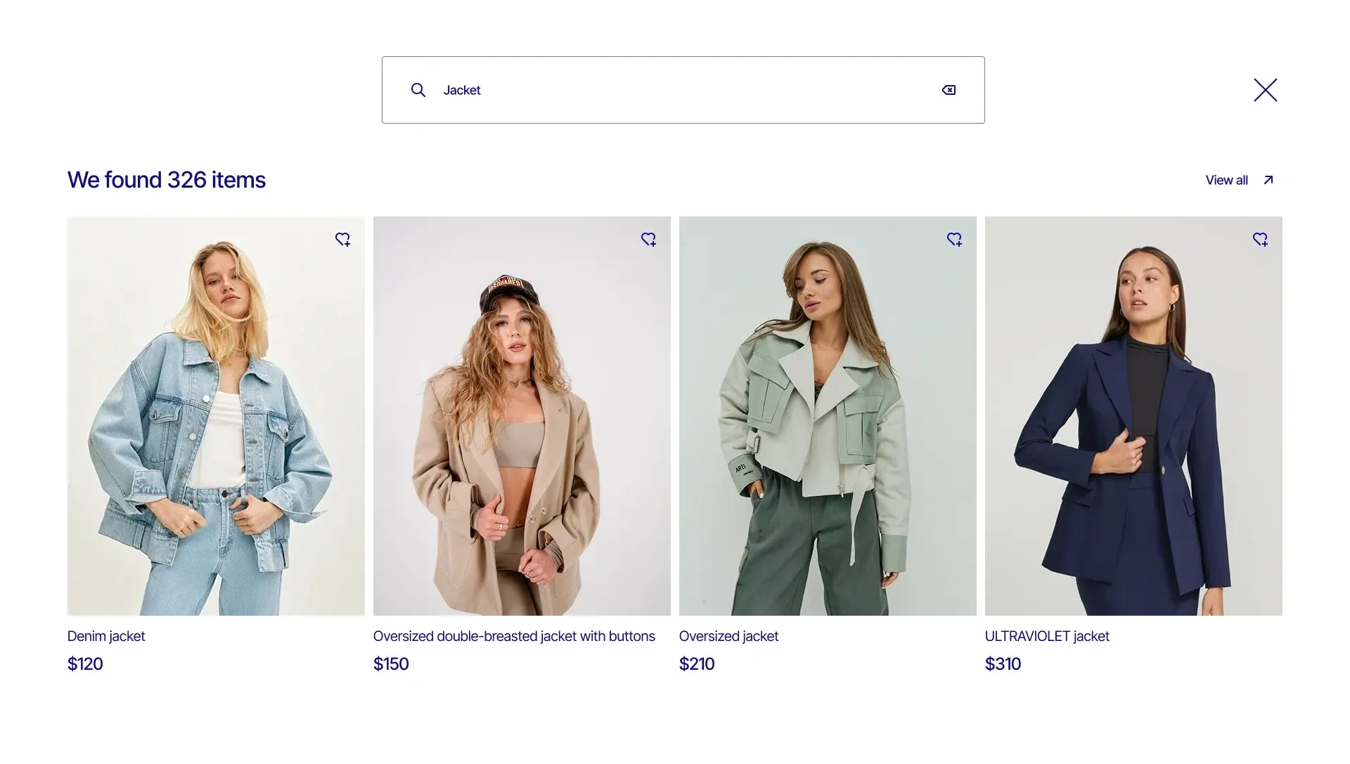
Search results show the count and a grid of products — 326 items, with prices and ready to filter. Someone who already knows what they're looking for shouldn't have to fight through the catalog to get there.
Built a size calculator so doubt gets resolved before ordering, not after a return
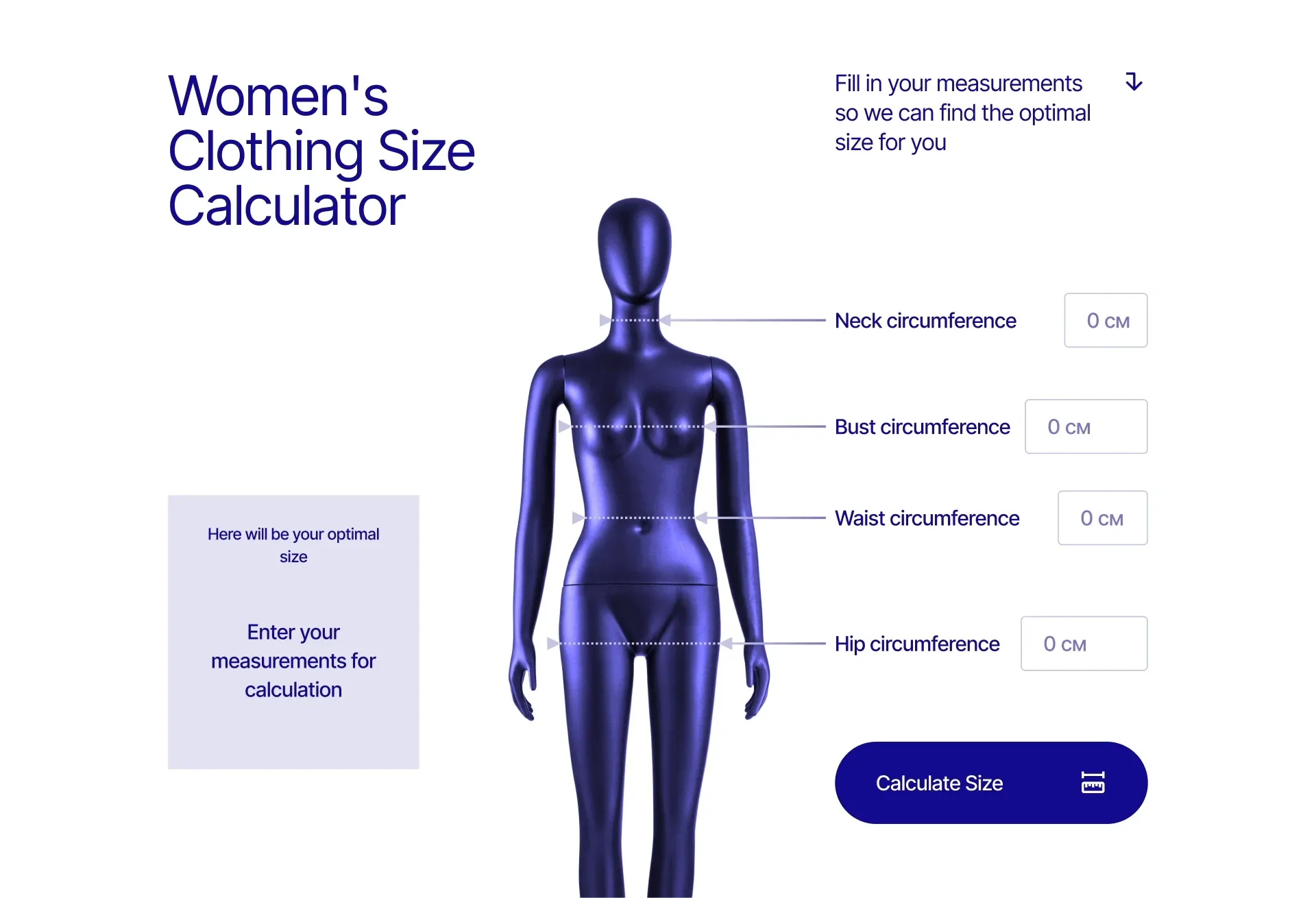
Size is the most expensive uncertainty in fashion e-commerce: a buyer in doubt orders either two sizes or none. The calculator asks four measurements and immediately gives an answer — one size, right on the product page, before anything goes into the cart.
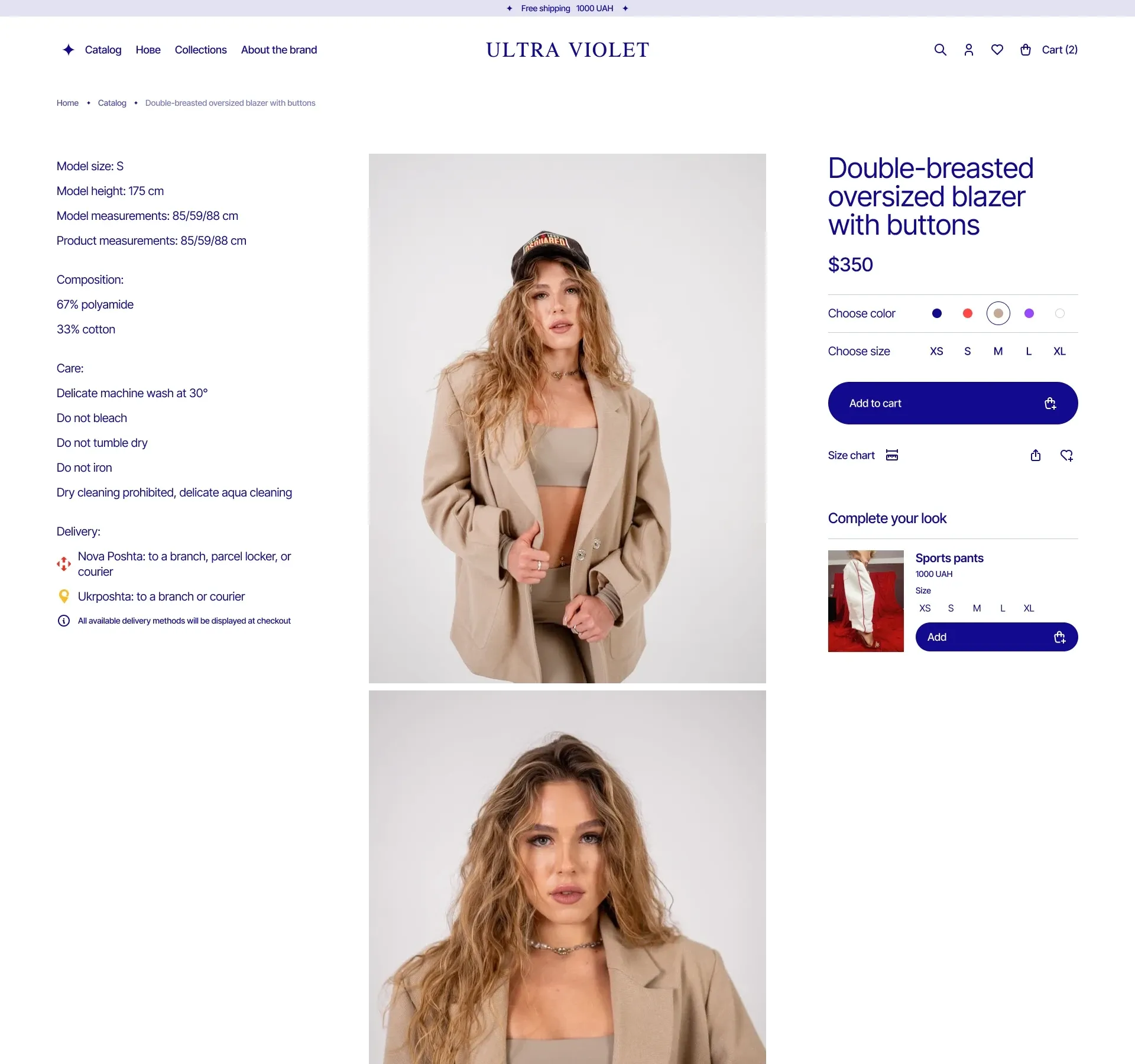
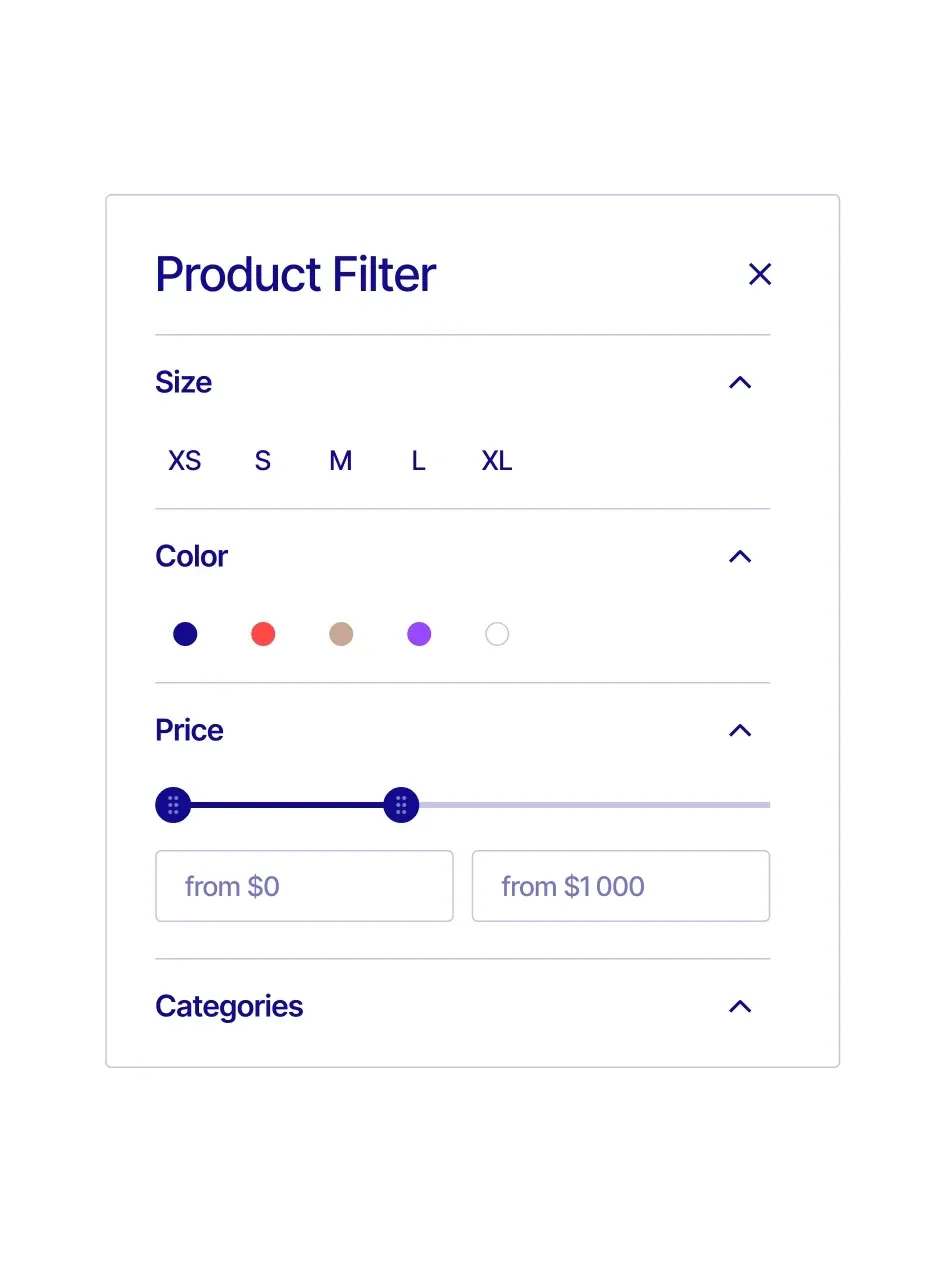
The desktop product page follows the same rule — everything on one screen. Photo in the center, details on the left, price and buy button on the right, so there's no scrolling back. Filters come next: size, color and price — right where the decision gets made.
Brought the store closer to the thumb and made the wishlist something you can send
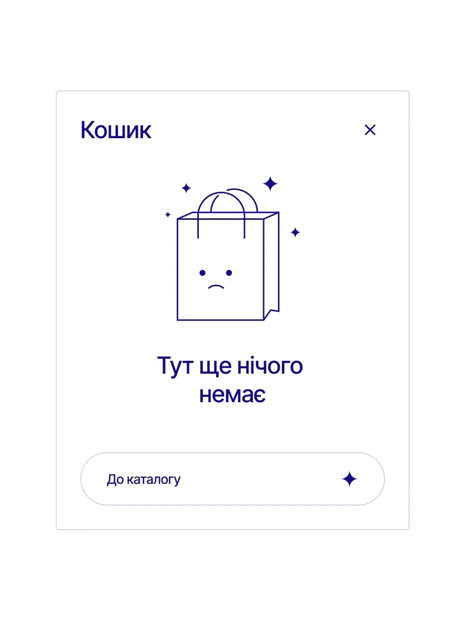
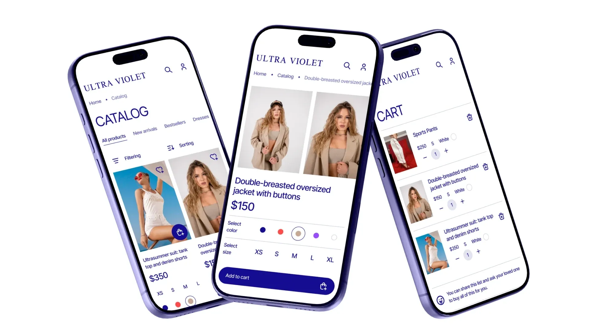
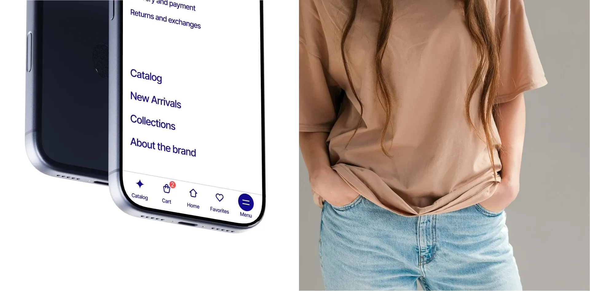
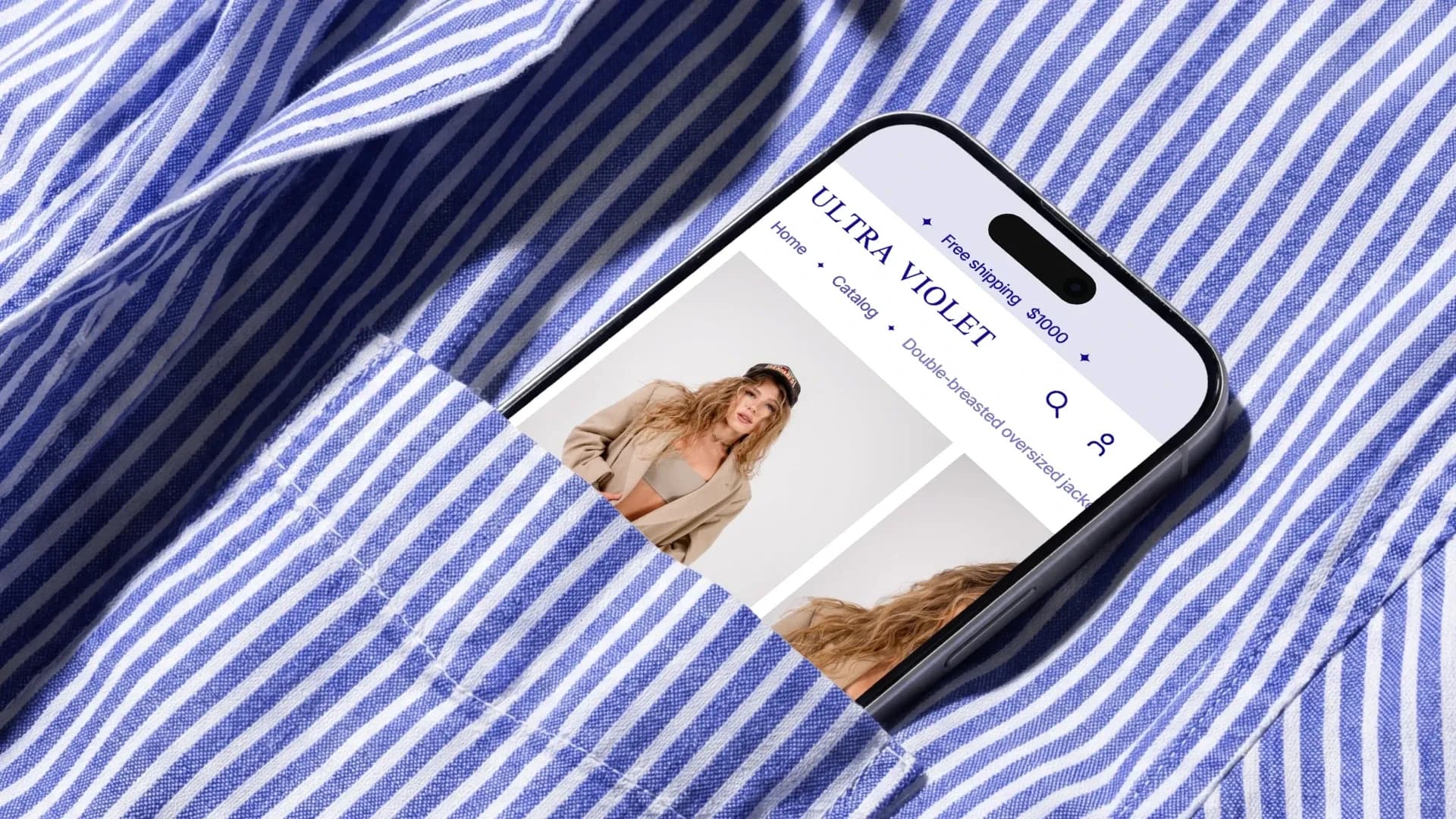
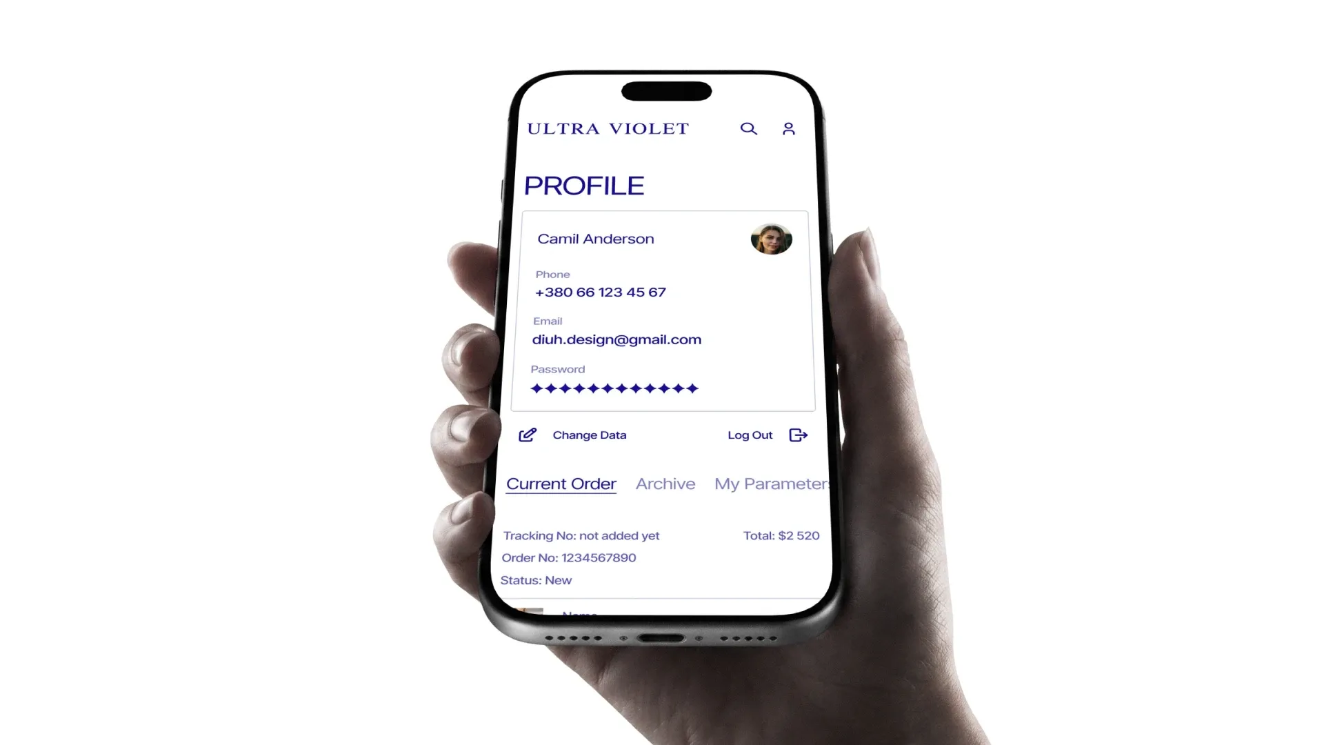
Mobile navigation sits at the bottom of the screen, not at the top: catalog, cart and menu — right where the thumb already is. Rebuilt the cart and account the same way — one-handed, no reaching across the whole screen.
A wishlist or a full cart can be sent to someone else to pay for. This turns a purchase into a gesture instead of a transaction, and gets the store a second buyer without any extra effort.
Gave the brand its own page and put support where new buyers actually go
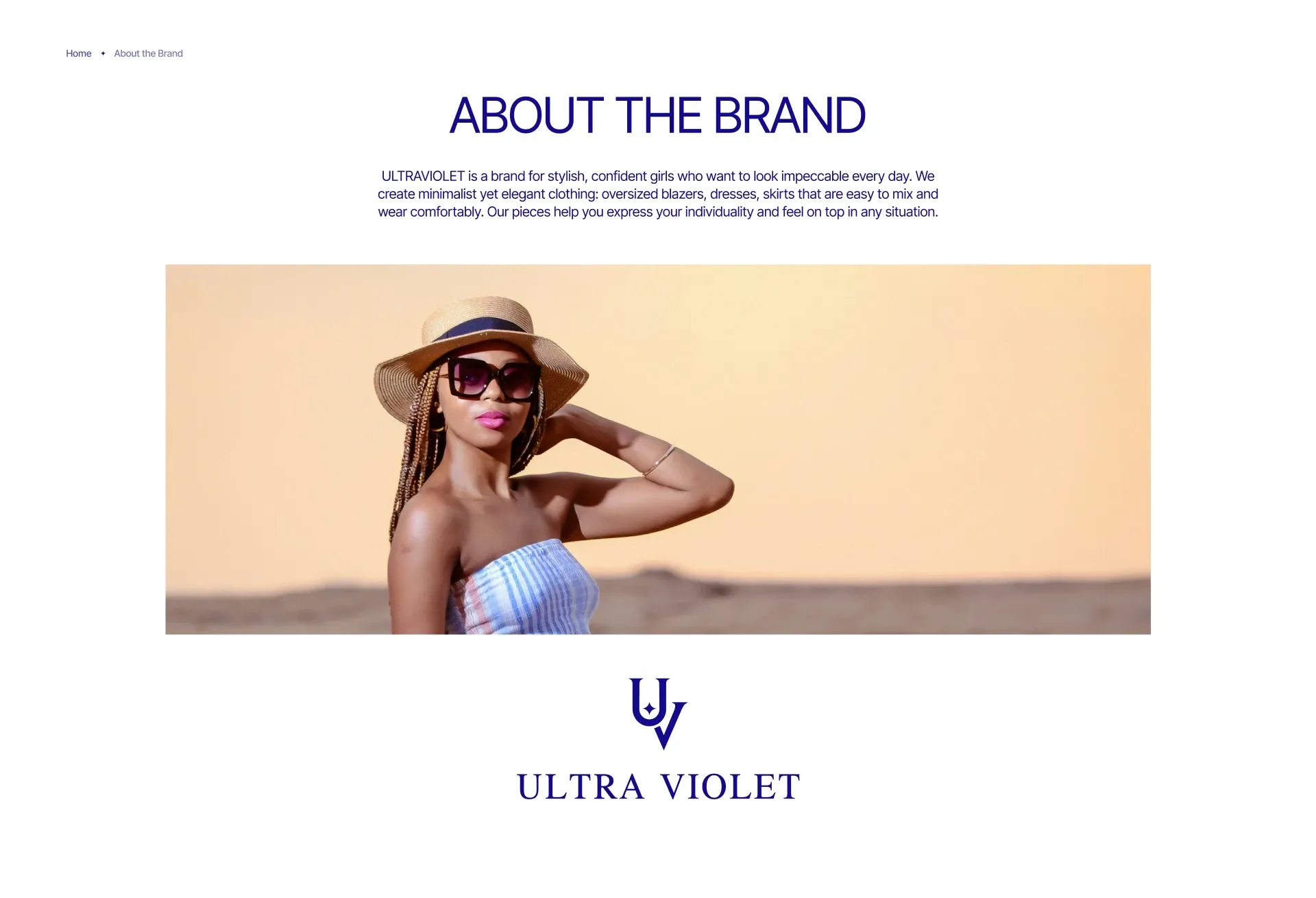
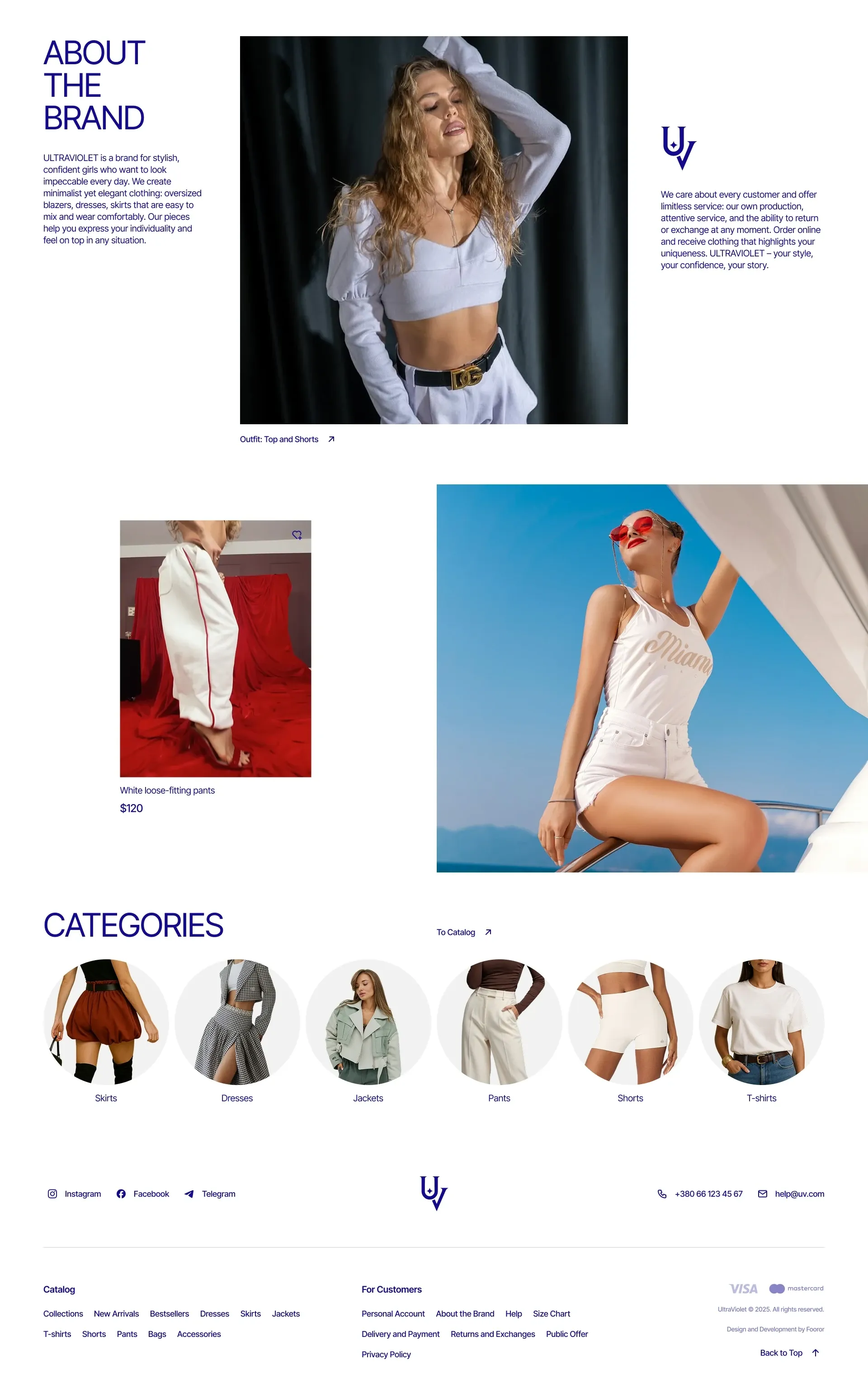
A young clothing brand is bought first on trust, and only then on product. The "about us" page carries exactly that: who UltraViolet is, what it does and in what tone it speaks — kept separate from the catalog, not squeezed into the footer.
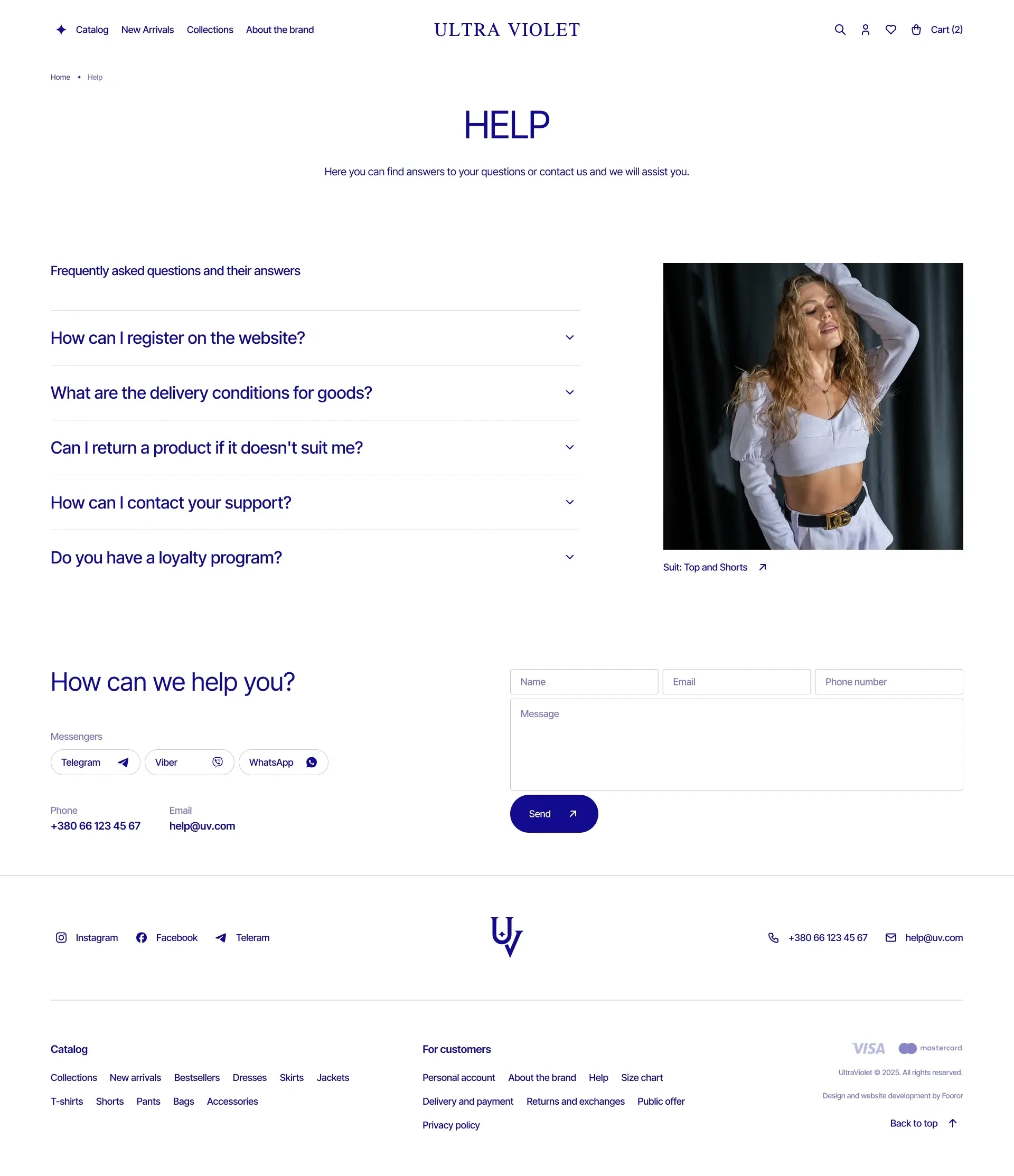
Support answers before the question is even asked. Registration, shipping, returns and the loyalty program are laid out as questions with answers, and the contact form sits right on the same screen — for anything the list didn't cover.
Other works
Drag the works sideways or use the left and right arrows. Automatic movement pauses on focus.