Cartonix
Online store
Brand and online store for cardboard 3D puzzles shipped from Ukraine to 213 countries
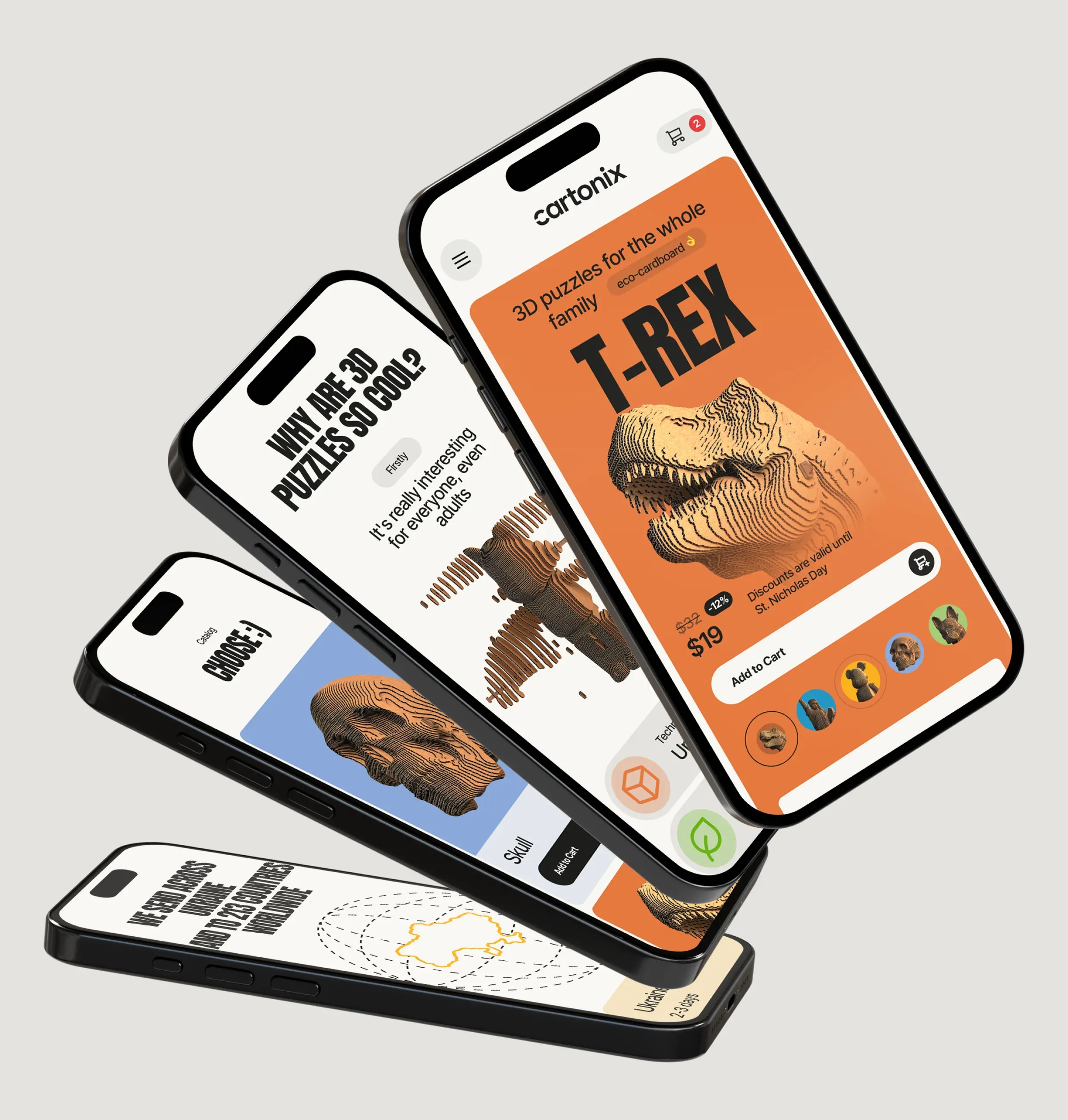
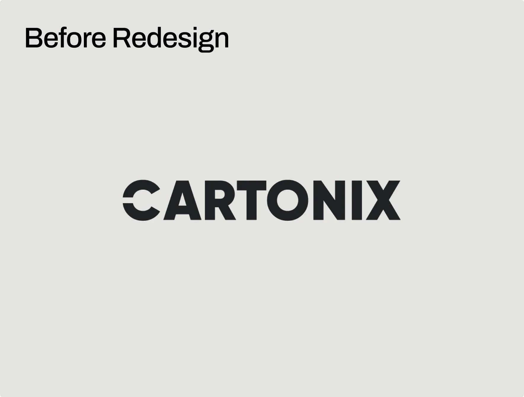
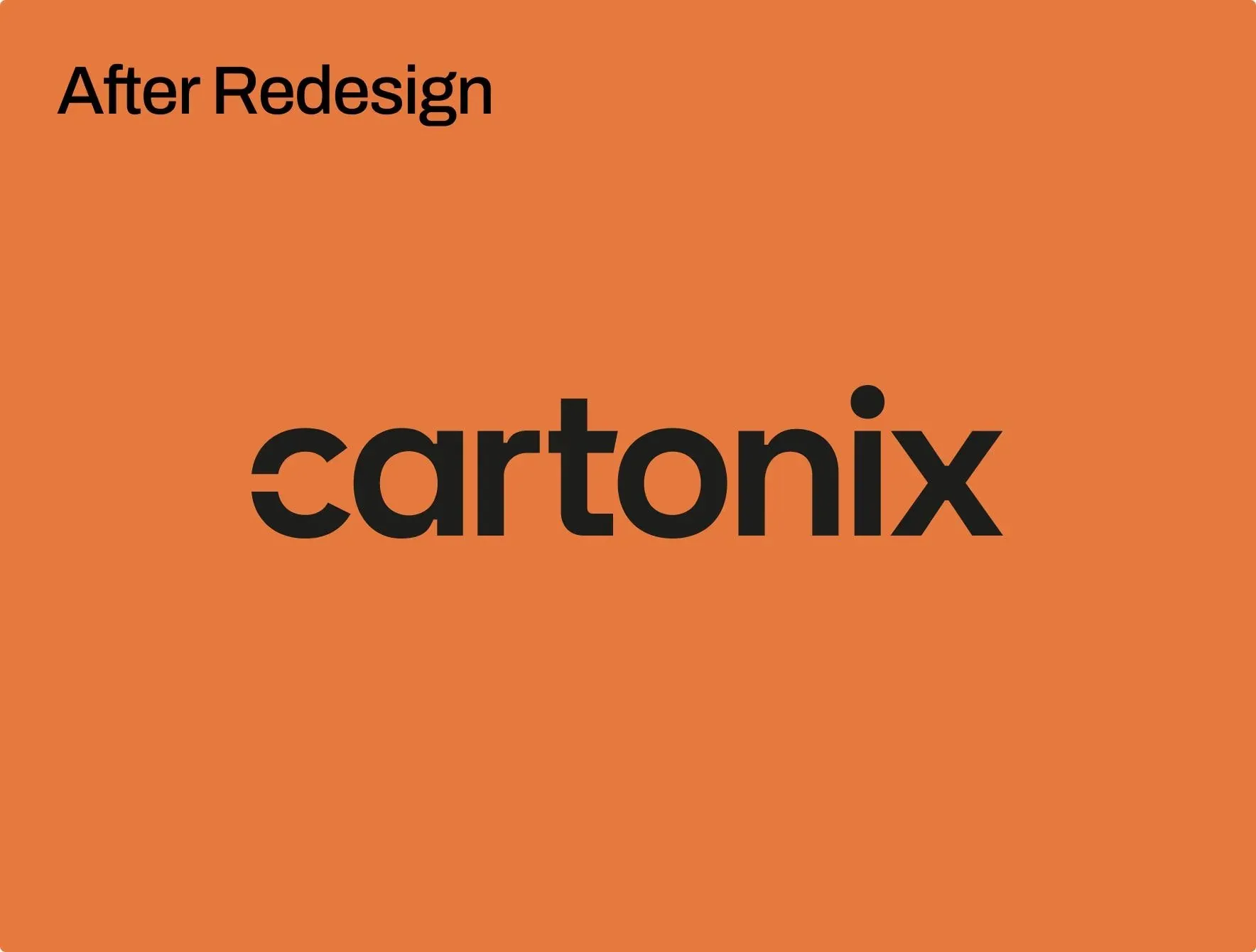
Rebuilt the logo to hold up at the size the box actually allows
The old logo was set in all caps, tight and heavy enough to compete with anything standing next to it. The packaging shows the product itself in a photo, and the logo has to give way to it.
The new logo is set in lowercase, geometric, with the letter C cut open — the same fold the product itself is made from. Lowercase also solved a practical problem: now the logo fits on the packaging, on a spray can, in a browser tab, and on a shipping box — without having to be redrawn for each surface.
Orange became the constant. The box color changes with every model, so the brand needed something fixed — and orange holds up on brown cardboard just as convincingly as it does on screen.
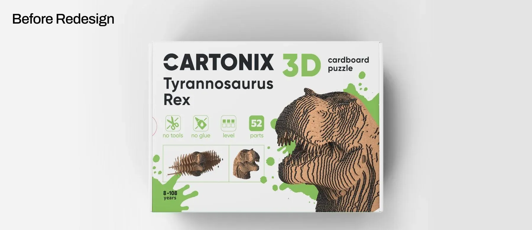
The old packaging had everything, and nothing in first place
Previously, every model shipped in the same white box. The assembled figure was printed small among decorative spots, the name was set in two lines next to the logo, and a row of icons ran along the bottom — no tools, no glue, difficulty level, number of parts.
None of this was a mistake. The problem was hierarchy: five elements competed at the same volume, so the eye had to search for the one thing that actually decides the purchase — what the assembled puzzle looks like.
And since the background stayed white across the whole lineup, the only thing telling a T-Rex apart from a bear in a grid of thumbnails was a small photo and a line of text.
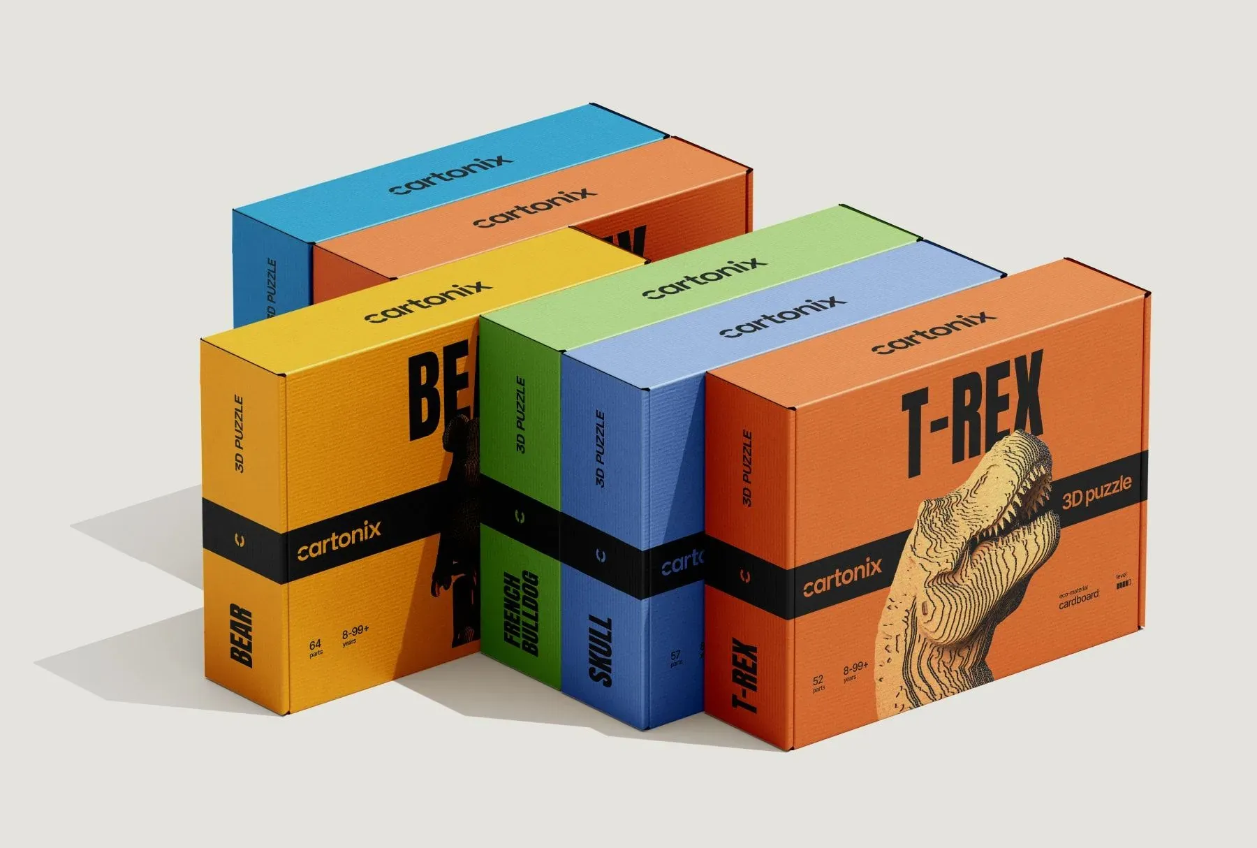
The new packaging leads with the assembled model and the name — in that order
In the redesign, the assembled sculpture is printed large enough to read across a room, and the model name is set in the largest size the panel can hold.
This order was chosen deliberately. In a marketplace thumbnail, the silhouette and the name are the only two things that survive being shrunk down; everything else on the box is meant for someone who's already holding it.
The icons stayed, but moved into a black strip along the bottom edge, where they read as a spec sheet rather than decoration. A buyer who needs the part count still finds it in a second — they just no longer have to step over it first.
Gave every model its own color and treated the insert as part of the brand
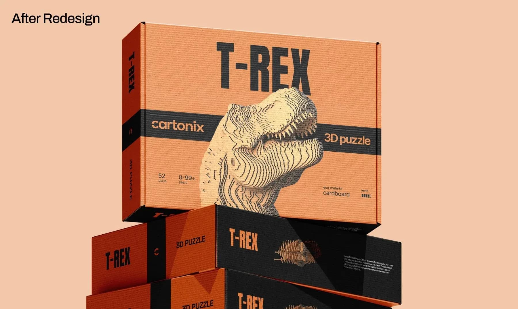
Every model has its own color — green for the bulldog, yellow for the bear, orange for the T-Rex. Color isn't decoration here: it's the fastest identifier possible — in the warehouse, in a photo, and in a catalog grid.
Because the structure never changes, color can do this job on its own. Same strip, same font, same placement — only the shade and the sculpture on the front change.
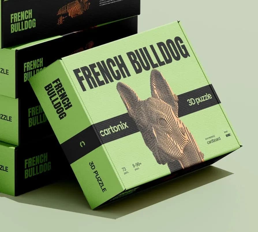
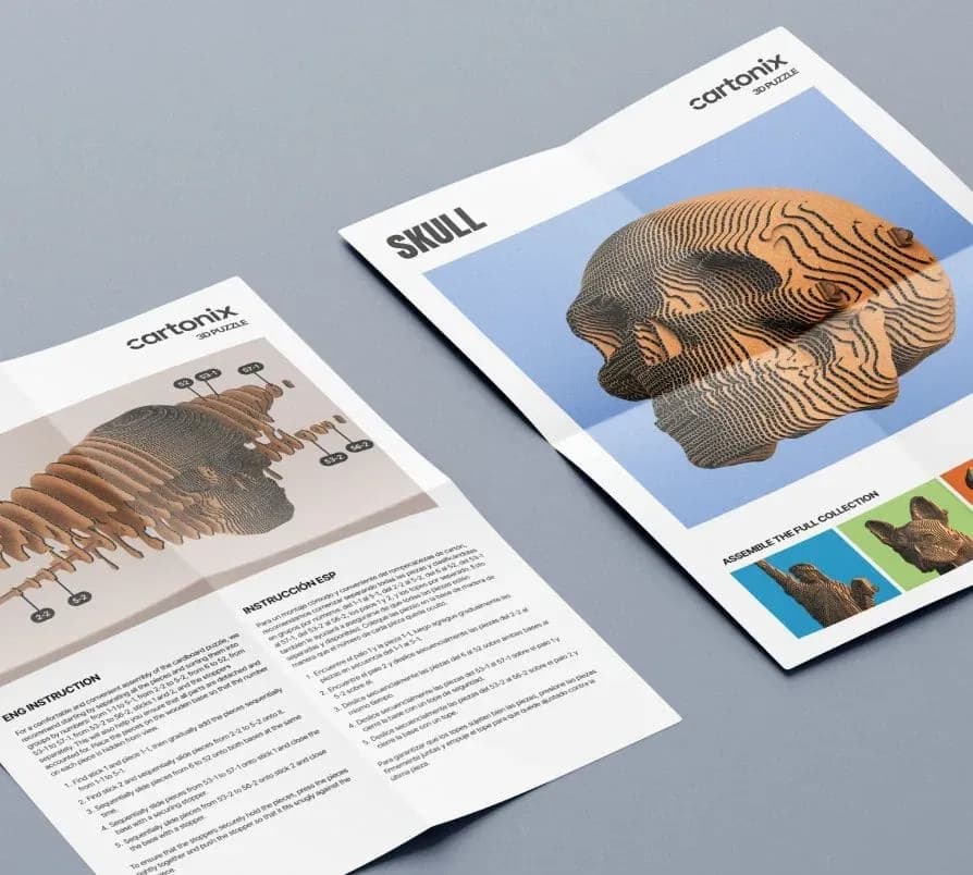
The insert card follows the same system. For a product whose entire point is assembly, the instructions are a second first impression, and a printer-paper copy buried in the box undoes everything the packaging just promised.
Laid out every package flat before ever showing it in perspective
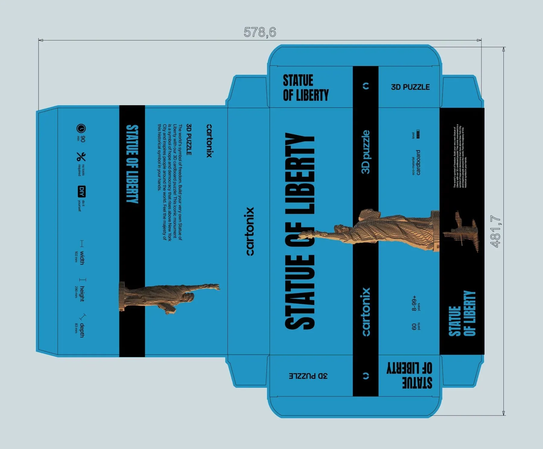
Drew every package first as a flat layout: every panel, every flap, and every fold line, at the actual dimensions of the cardboard box.
This is where the real decisions get made — which panel carries the barcode, where the black strip crosses a fold line, how the name reads on the side when the box is stacked with others on a shelf.
A mockup can make almost any composition look convincing. The flat layout is what proves it will still be correct once the cardboard is actually cut and folded.
Together, the lineup reads as one brand, not five separate products
Side by side, the packages share everything except color and sculpture: the same strip in the same place, the same font at the same size, the same structure on every panel.
This is what makes the system worth having. A new model needs a color and a photo, not a redesign — everything else is already decided, and stays decided as the lineup grows.
Opened the store with the finished object and put proof right below it
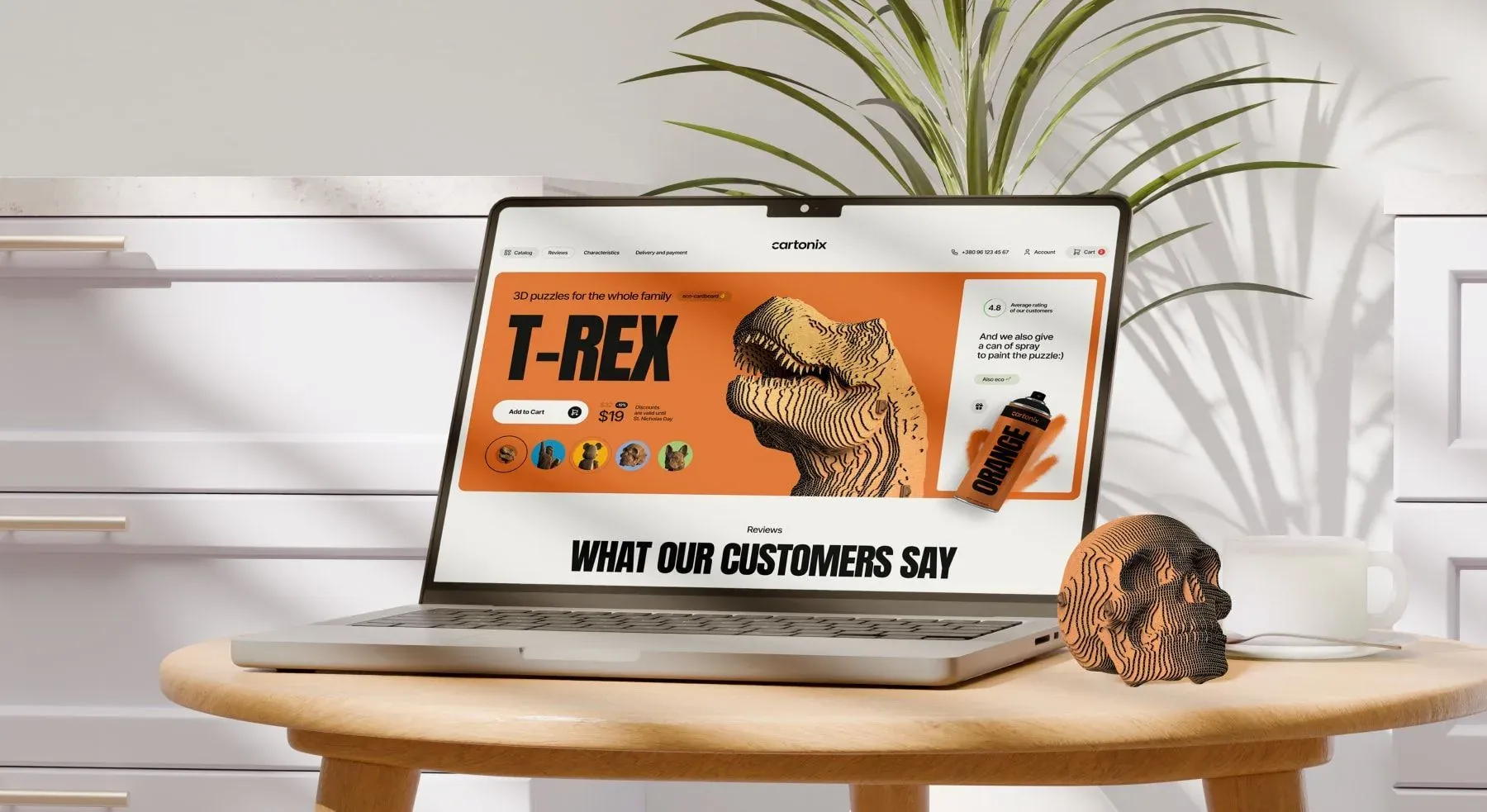
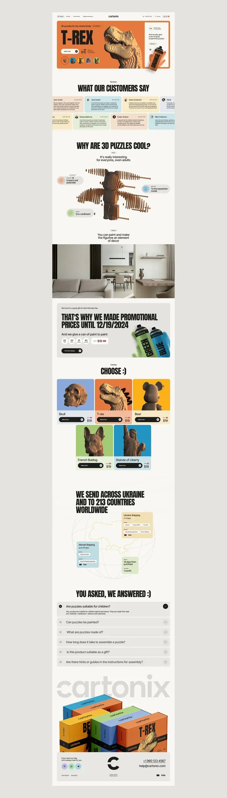
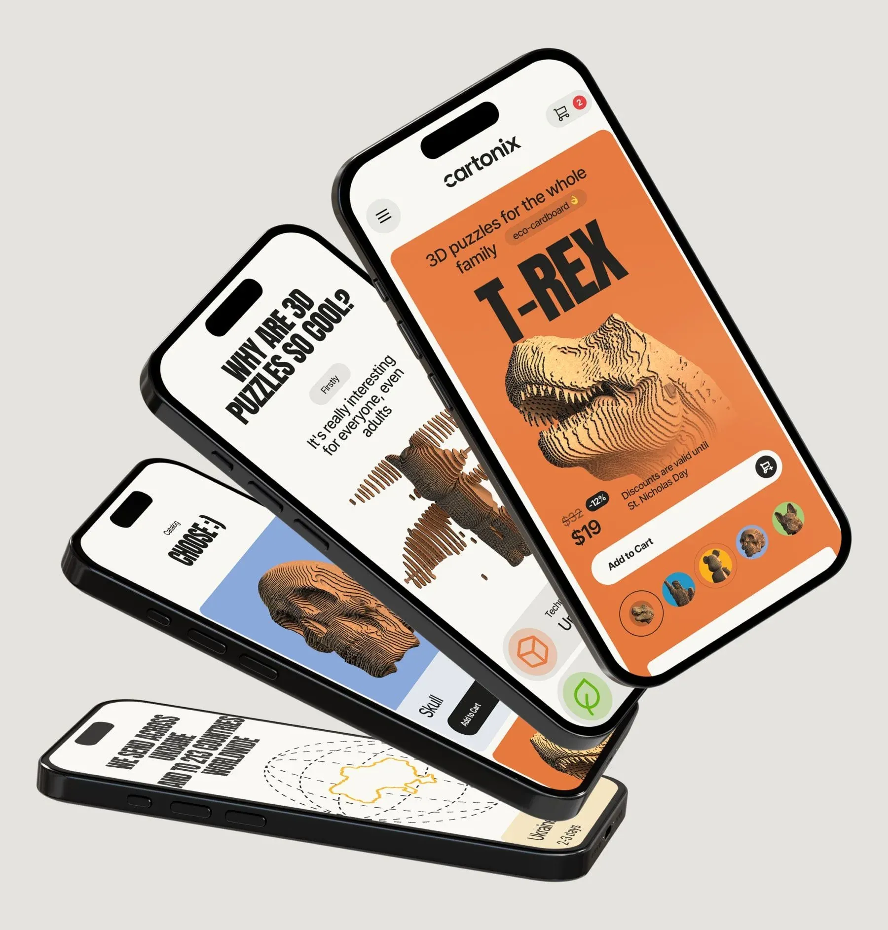
The homepage opens with the assembled model, not the box. The buyer is choosing a finished object; the packaging is just what it arrives in.
Customer reviews sit right below the hero section. For a product most visitors have never held, proof needs to show up before persuasion — and on a phone, it needs to show up before the first scroll ends.
Next comes an explainer block: what a cardboard 3D puzzle is, how it's assembled, how long it takes. A large share of traffic has never bought anything like this before, and this block is what separates curiosity from a cart.
Further down the page, shipping is stated plainly — within Ukraine and to 213 countries — and everything wraps up with an FAQ section that absorbs the questions that would otherwise land in support: is it suitable for kids, can it be painted, does it work as a gift.
Taught the catalog the same color code as the shelf, and designed it mobile-first
The catalog uses the exact same color code as the packaging. A buyer who's seen the orange T-Rex box finds the orange T-Rex card, and that connection doesn't cost them a single thought.
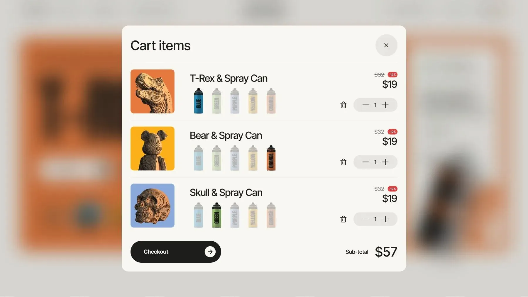
A can of paint is offered right next to every model, not on a separate page. It's the only add-on that raises the cart total without asking the buyer to make a new decision, so it belongs next to the product and inside the cart — not somewhere they have to go looking for it.
The store is designed mobile-first, and the mobile version walks through the whole argument in order: product, price, add to cart, then the explainer block and the catalog. Nothing that worked on desktop got left there.
Kept the order in view throughout checkout and built the account dashboard around the one screen people come back for
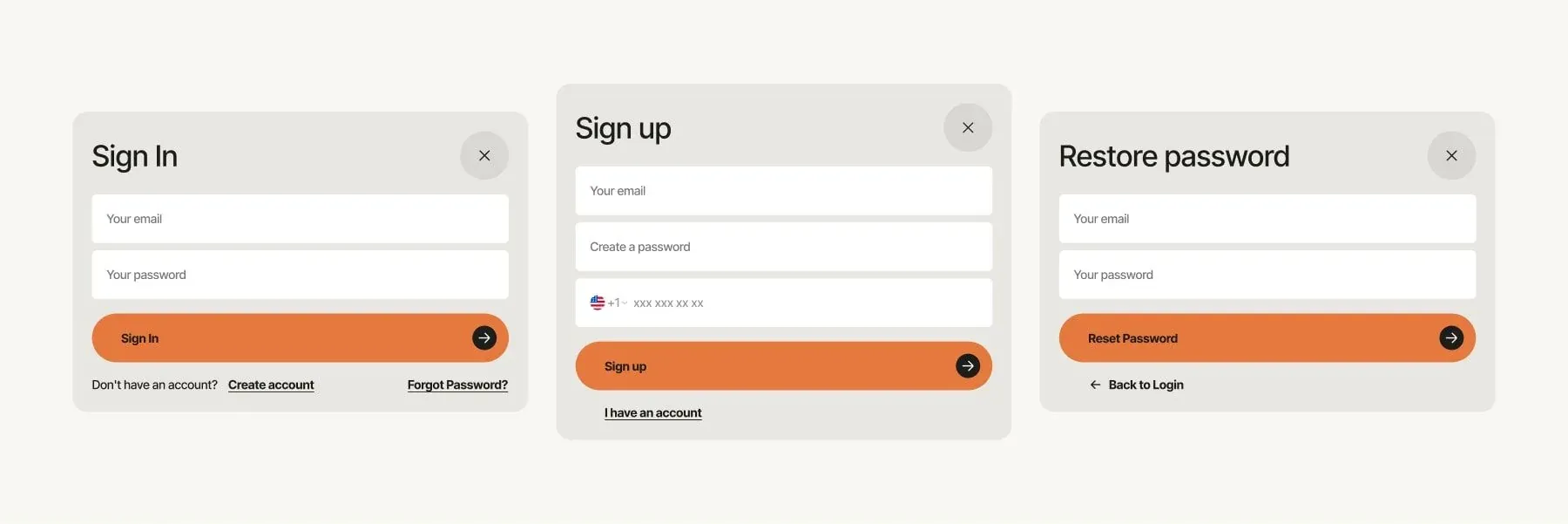
Login, sign-up, and password recovery all use one modal pattern, so creating an account never costs a page reload mid-purchase. The shopper stays right where they were.
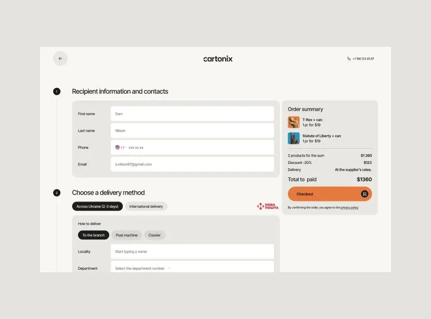
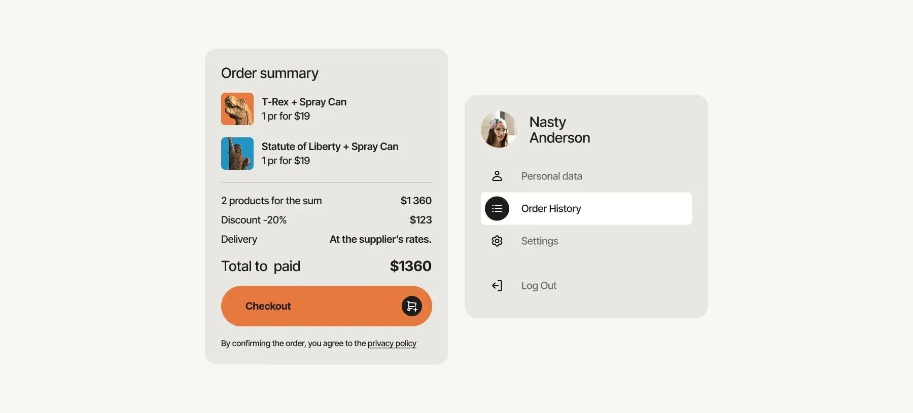
Checkout keeps the order in view while the form is being filled out: recipient and shipping on the left, summary and total on the right, on one screen. Every field removed from checkout is a shopper saved, and every number hidden from them is a shopper lost.
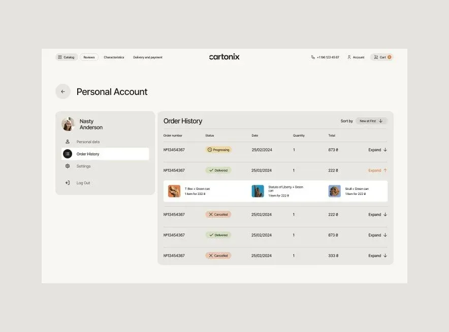
The account dashboard is built around the one thing a returning customer opens it for — an order history that's clear at a glance, with each order's status written in words, not just marked by color.
Other works
Drag the works sideways or use the left and right arrows. Automatic movement pauses on focus.