Traffbraza
Landing page
An HR landing page built to attract media buyers, not to explain what the company does

Started with the numbers a media buyer checks before reading anything else
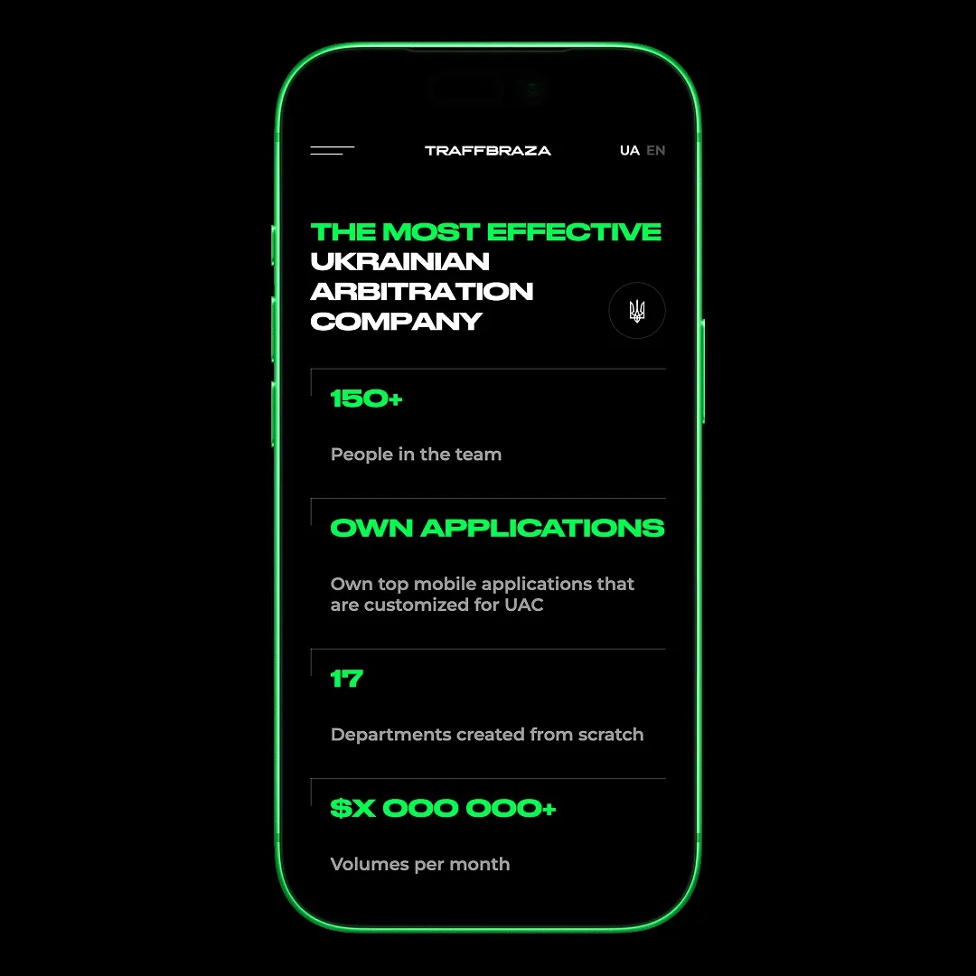
TRAFFBRAZA is a Ukrainian affiliate company working with Google traffic in the gambling vertical: over 150 specialists, 17 automated departments built from scratch, and its own mobile apps made for UAC.
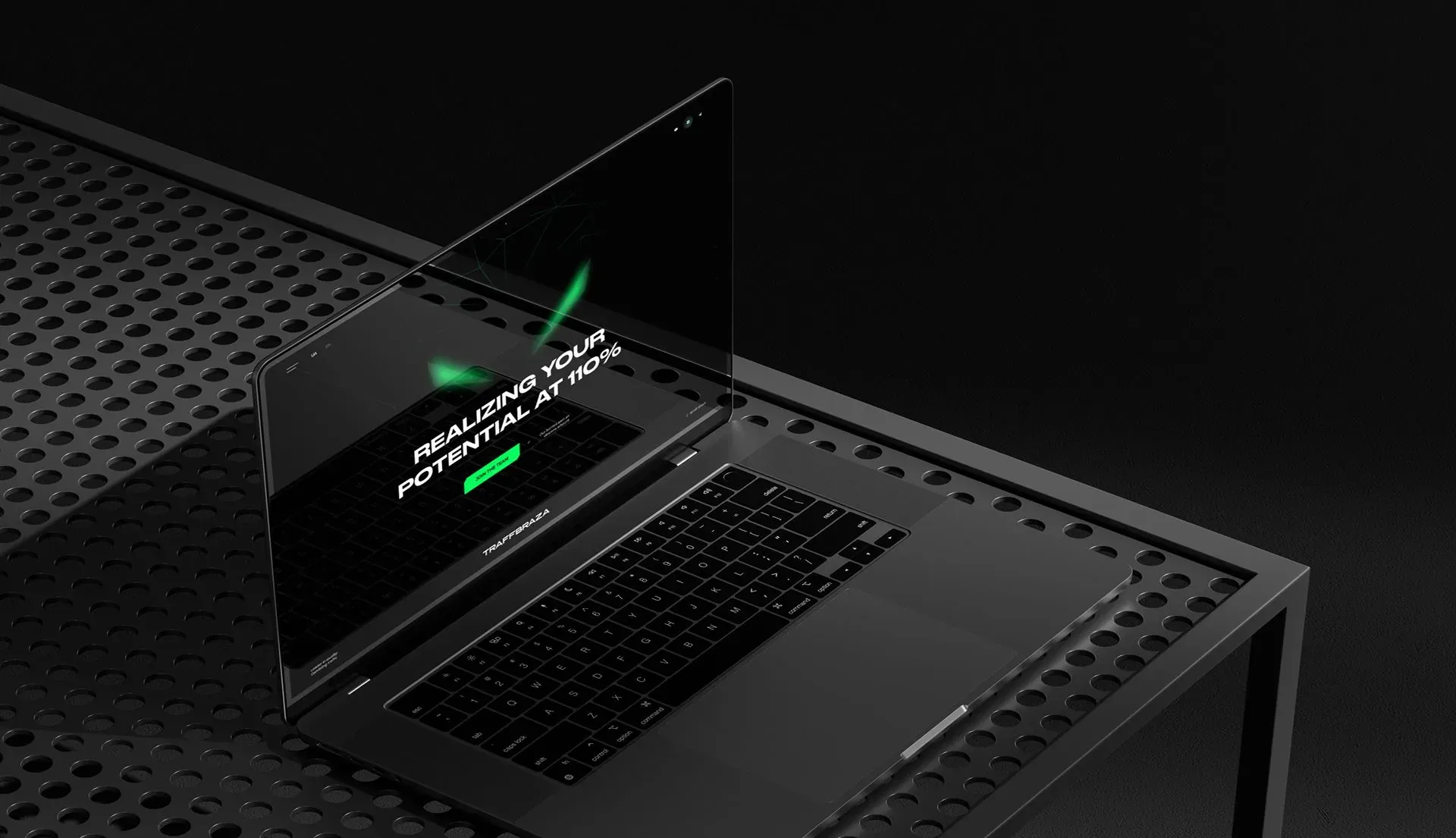
The site has exactly one job — to convince a media buyer to join the team. That's why the first screen is the scale of the operation laid out in numbers, and the visual language is deliberately hard: technical, current, and not trying to please anyone.
Placed the navigation in a full-screen menu and left almost no static states behind it
The navigation opens as a full-screen layer over the content, not as a bar sitting on top of it: on a page this dark, a menu that just stays put reads as decoration, while something that takes over the whole screen reads as a decision.
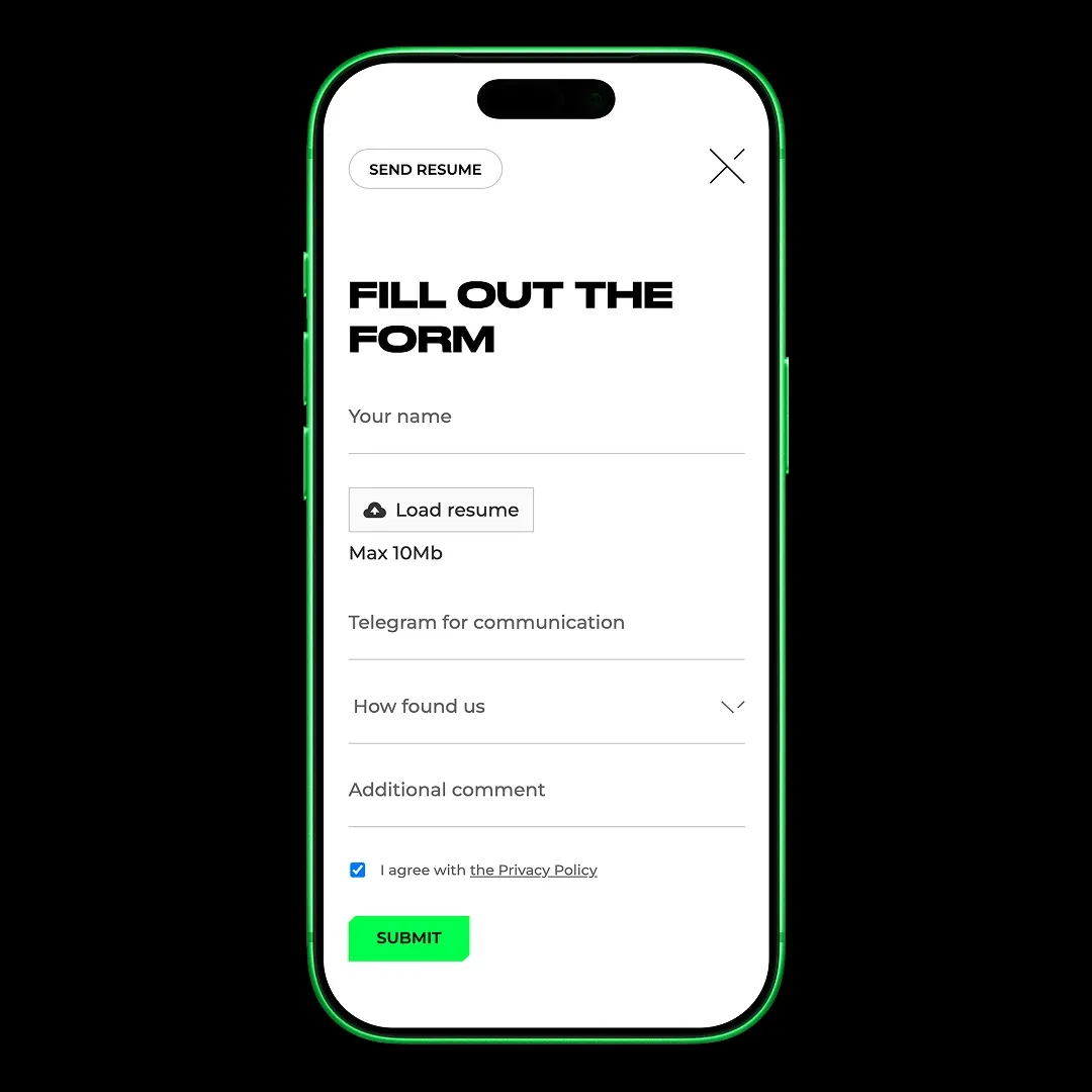
Everything else responds to the cursor and scroll. Partners move in a carousel, the job application form works as a multi-step flow with a progress indicator, and even the 404 page isn't static — there's almost no place on this site where nothing is happening.

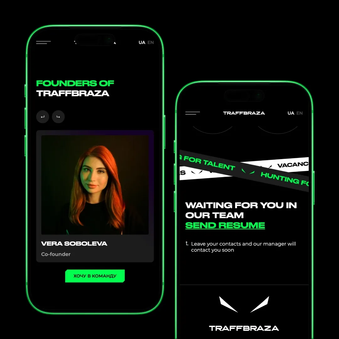
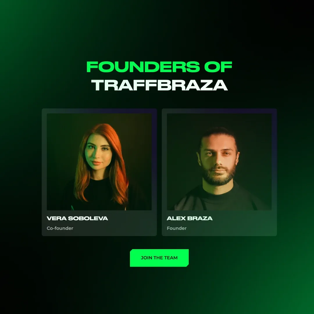
Answered the buyer's only question: what's in it for them
The offer is laid out as four numbered points, not a paragraph of text — pay, growth, departments already built, environment. A buyer choosing between teams compares exactly these four things and little else.
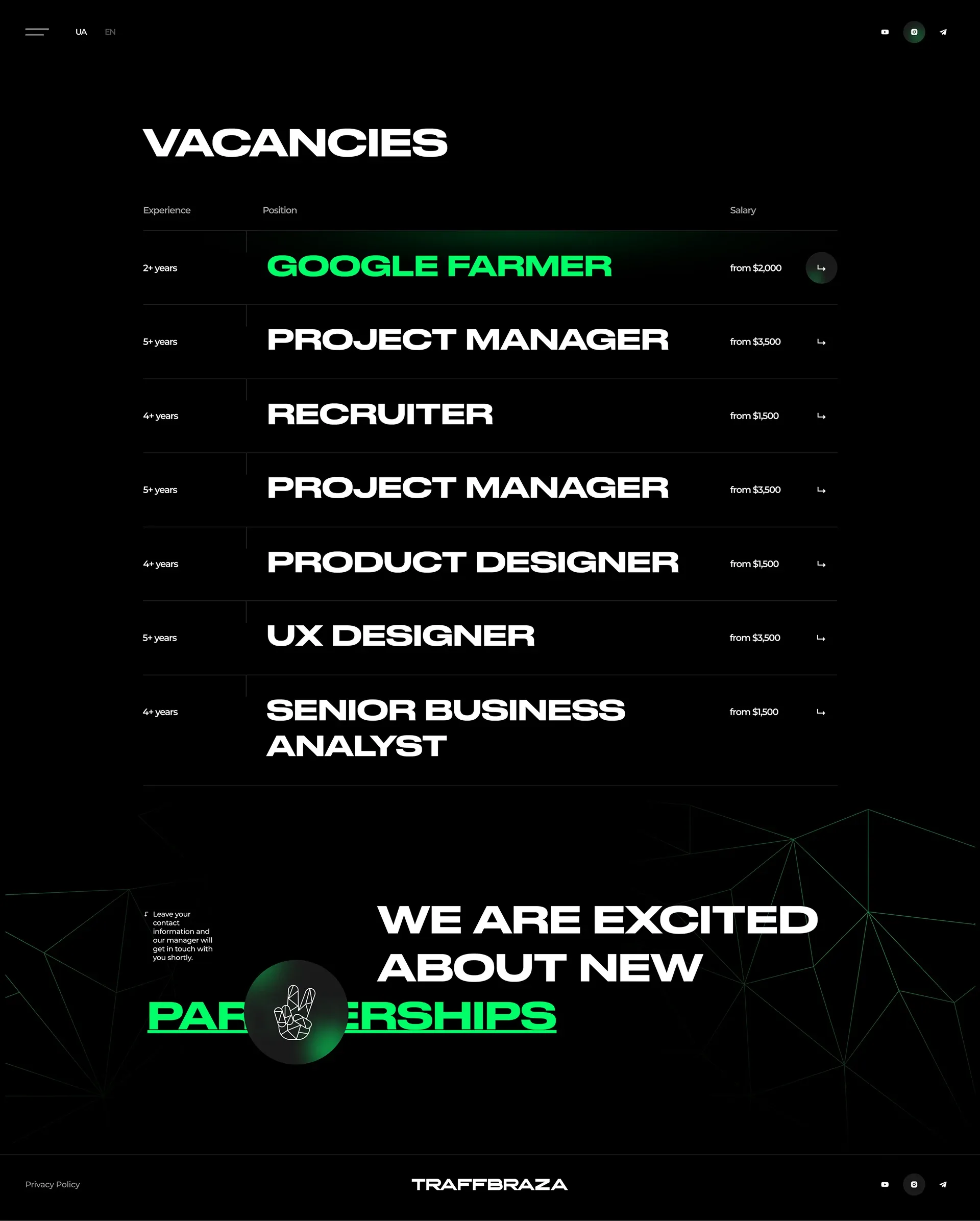
Each job opening then opens as a separate page with a full list of requirements, so the decision to apply is made on the site, not in a chat with a recruiter.
Other works
Drag the works sideways or use the left and right arrows. Automatic movement pauses on focus.